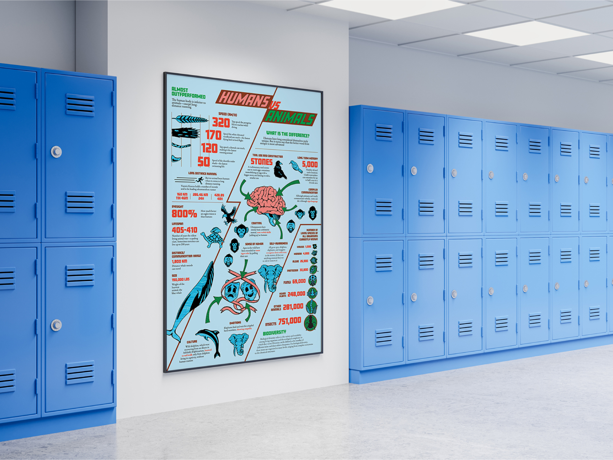

This was a school project to design an infographic poster about comparing human and animal facts. The goal was to organize and display the information in an eye-catching and easy to understand manner.
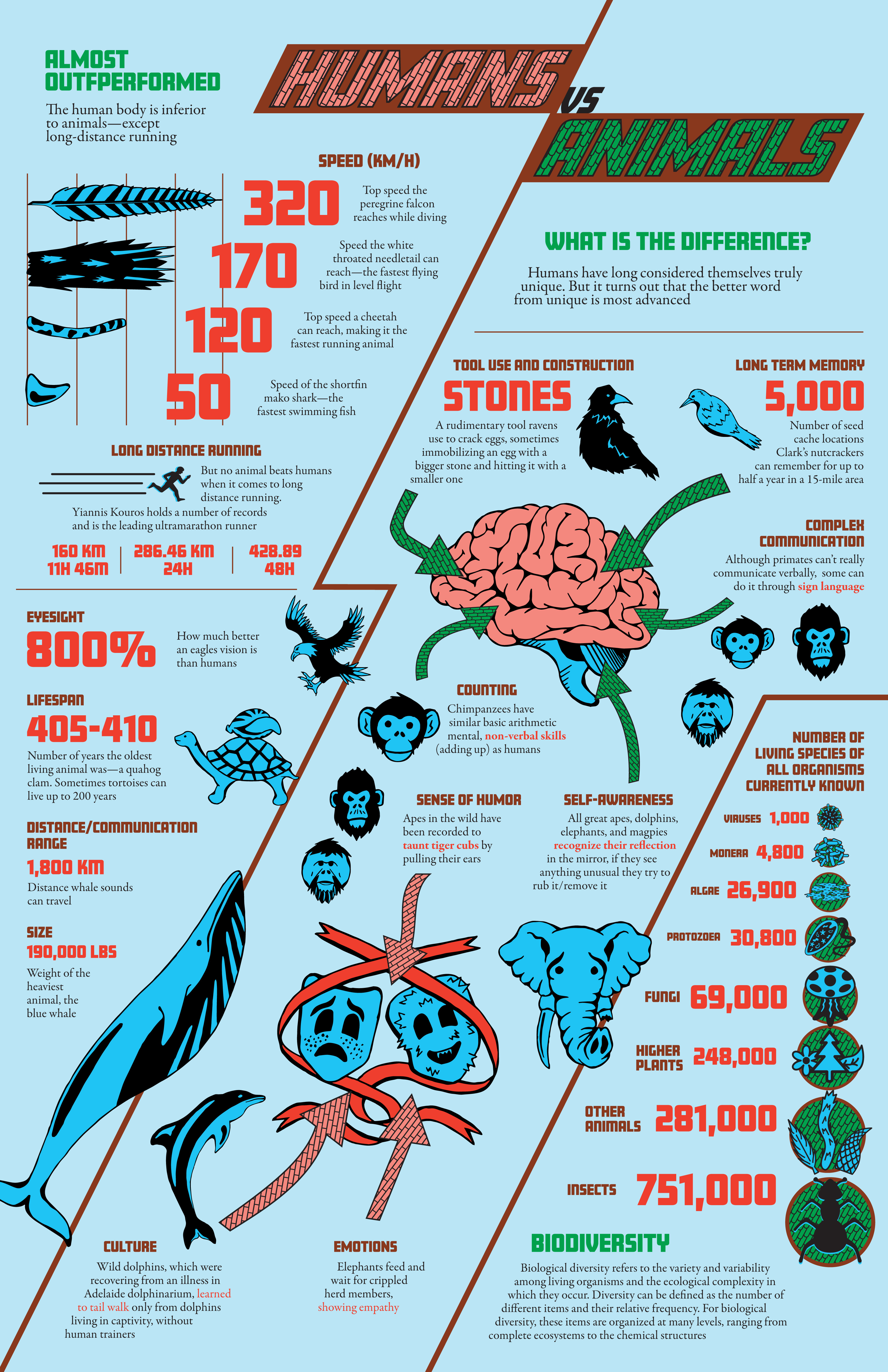
We were given raw text comprised of the title Humans VS Animals and 3 sections called What is the Difference?, Biodiversity, and Almost Outperformed. The sections contained small paragraphs about various animal and human facts.
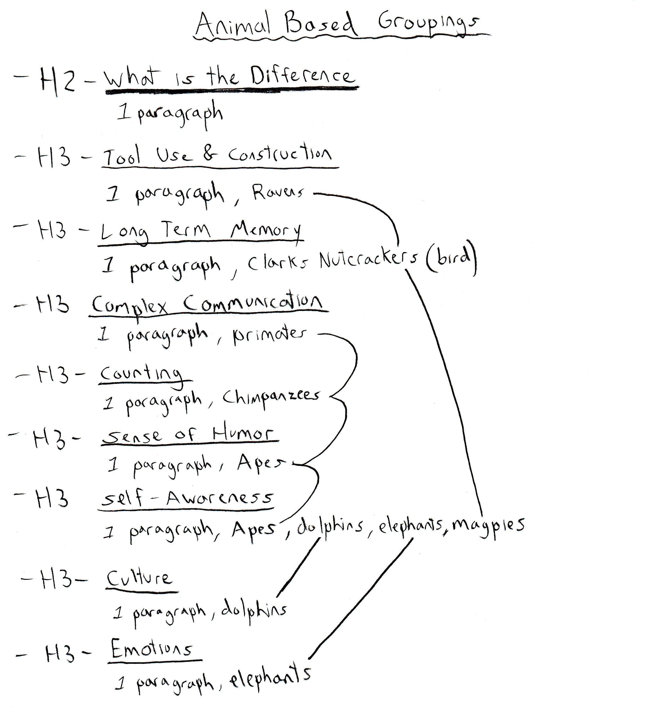
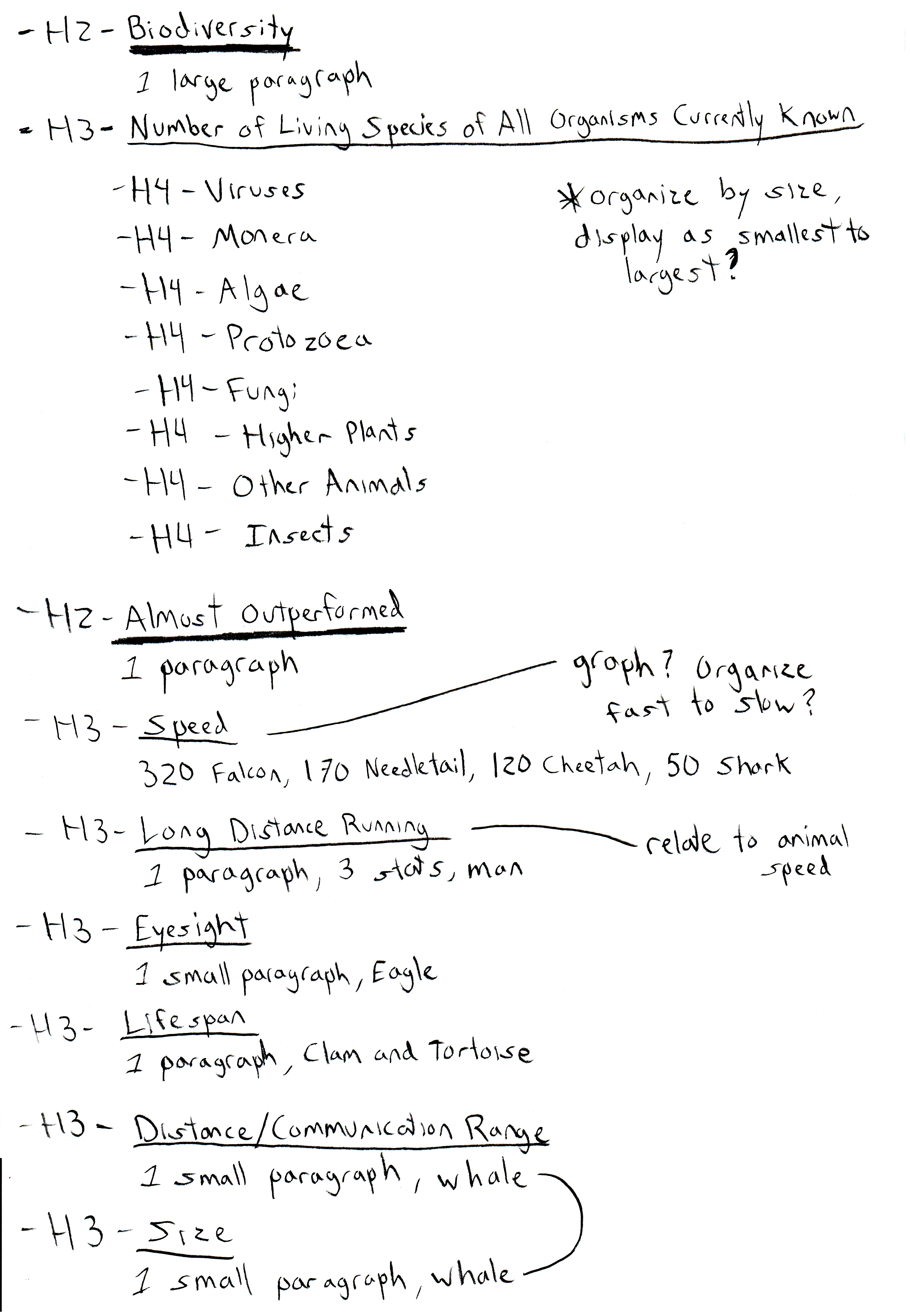
My first step was summarize the text in list form, and connect similar animal types to possibly group together on the infographic. This list also helped me with some initial ideas and gave me a sense about what I was working with.
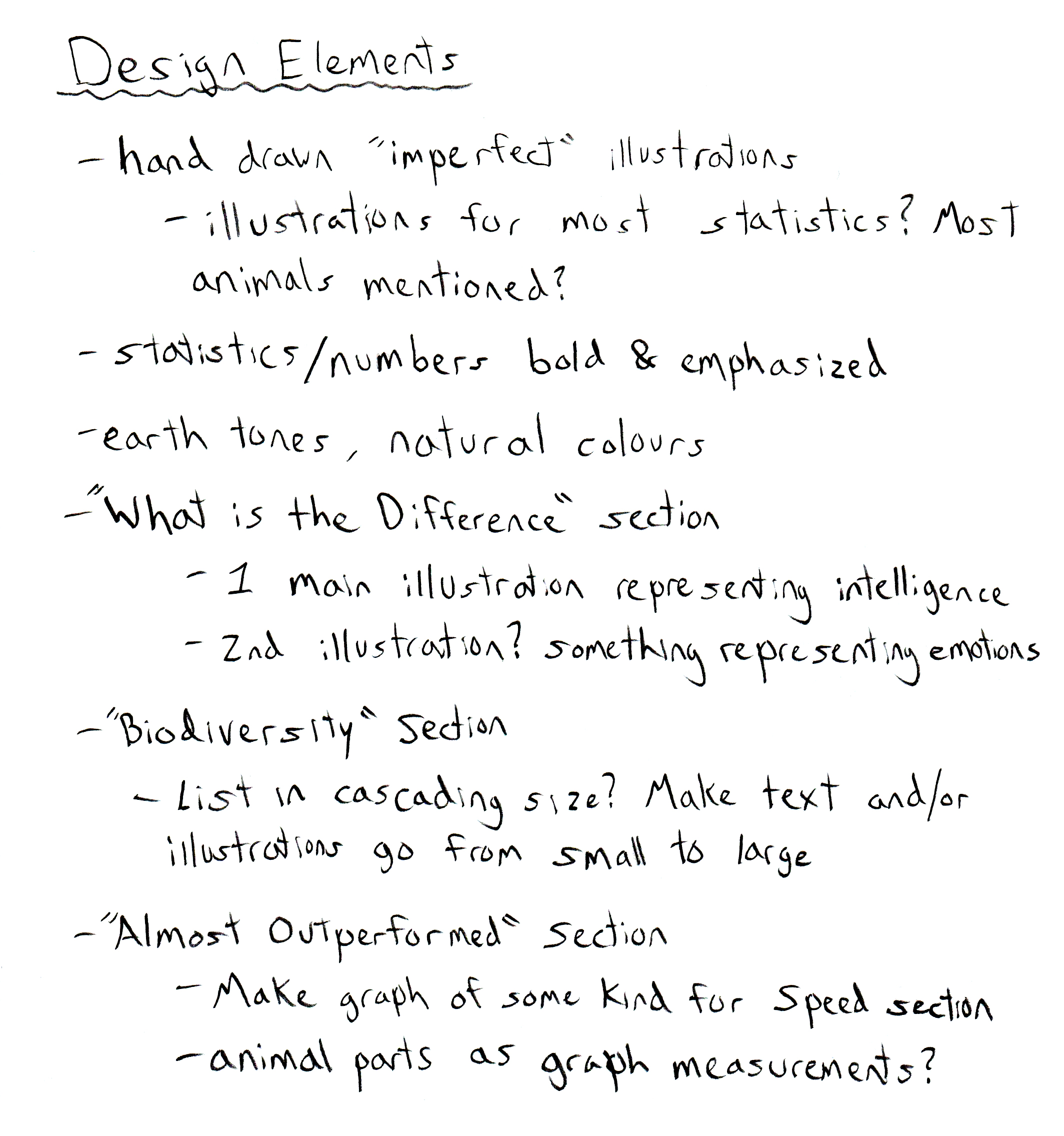
After looking at other infographics and inspiration online, I came up with some ideas. Some of my initial plans were to draw illustrations in a more natural/rough style to match the theme. I had to figure out which animals would work best to use throughout the design as well. I also knew the statistics and numbers needed to be emphasized so people skimming the infographic could still learn information easily. I decided to create 1 or 2 central illustrations to use as focal points for the main What is the Difference? section. For the other 2 sections I also began brainstorming interesting ways to visually display the information.
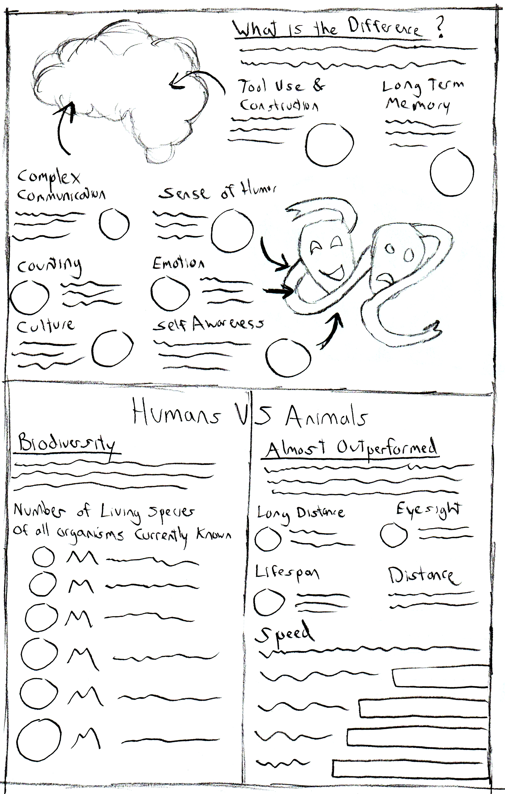
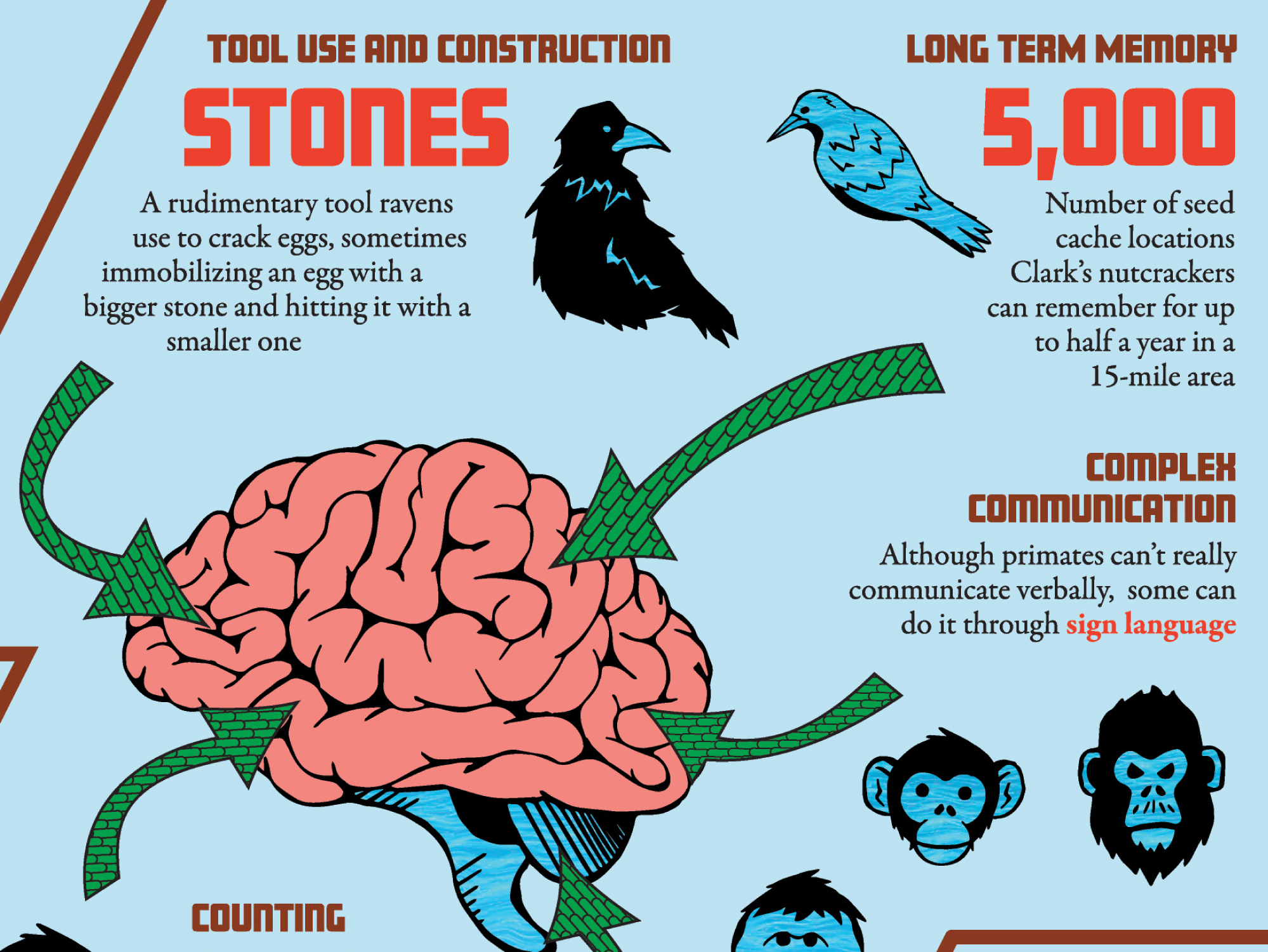
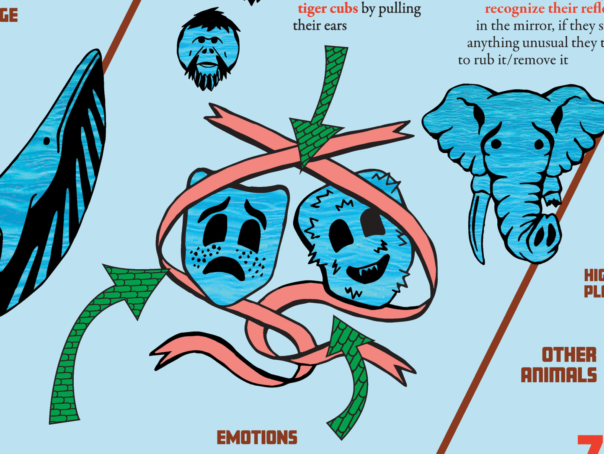
I began to sketch different layout ideas around how to best divide the information. Most were standard box shapes but I did design one that was split up diagonally. I also noticed the What is the Difference? section had some statistics that were examples of intelligence in animals, while others were more examples of emotion in animals. Noticing this, I thought drawings of a brain and happy/sad theatre masks would work here. Using arrows to point towards these illustrations would also be an easy way to direct the viewer.
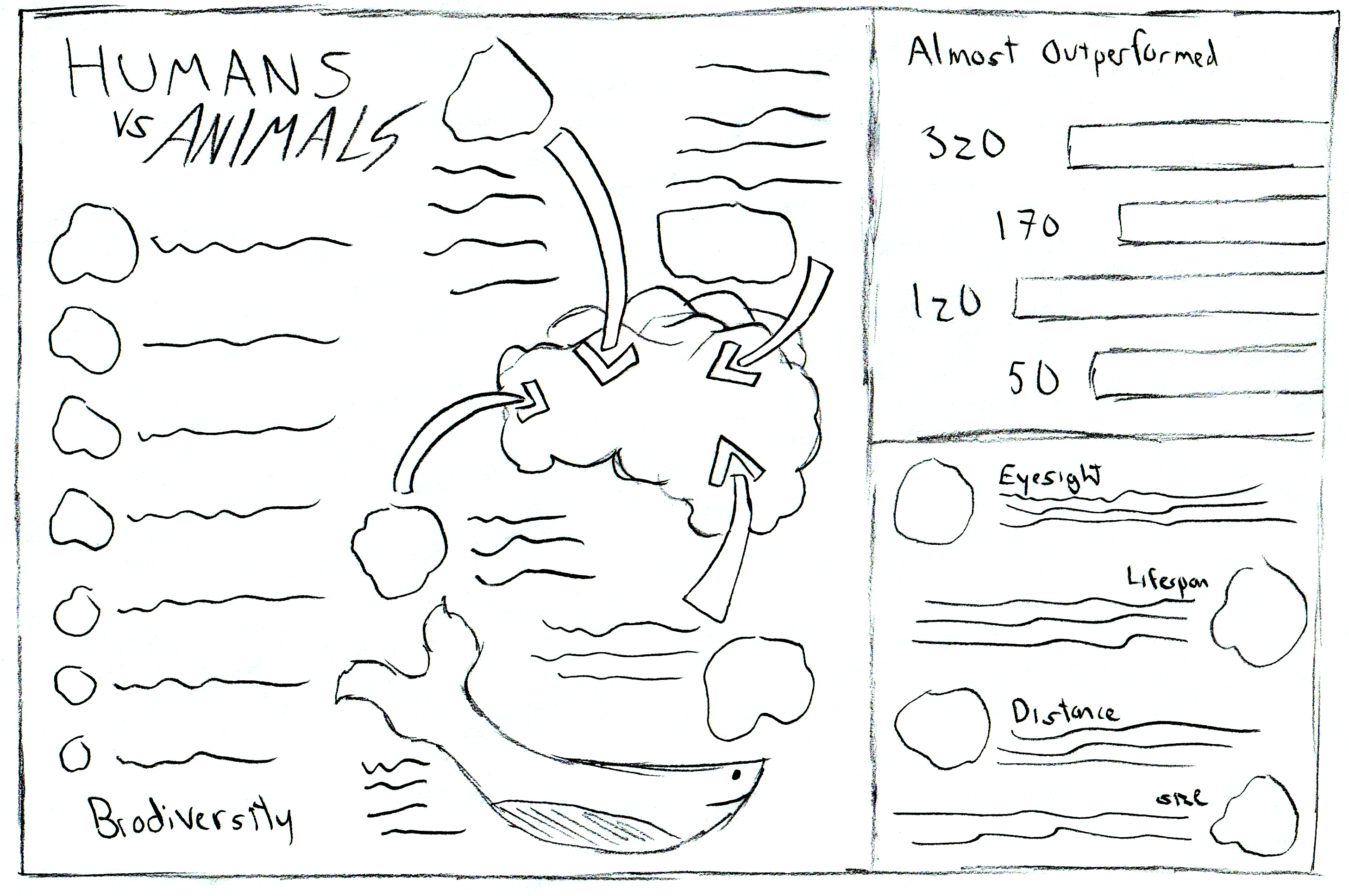
The Biodiversity section had numbers ascending in size so it might be helpful to display the text/images also growing in size. I had similar ideas for the graph in the Almost Outperformed section.
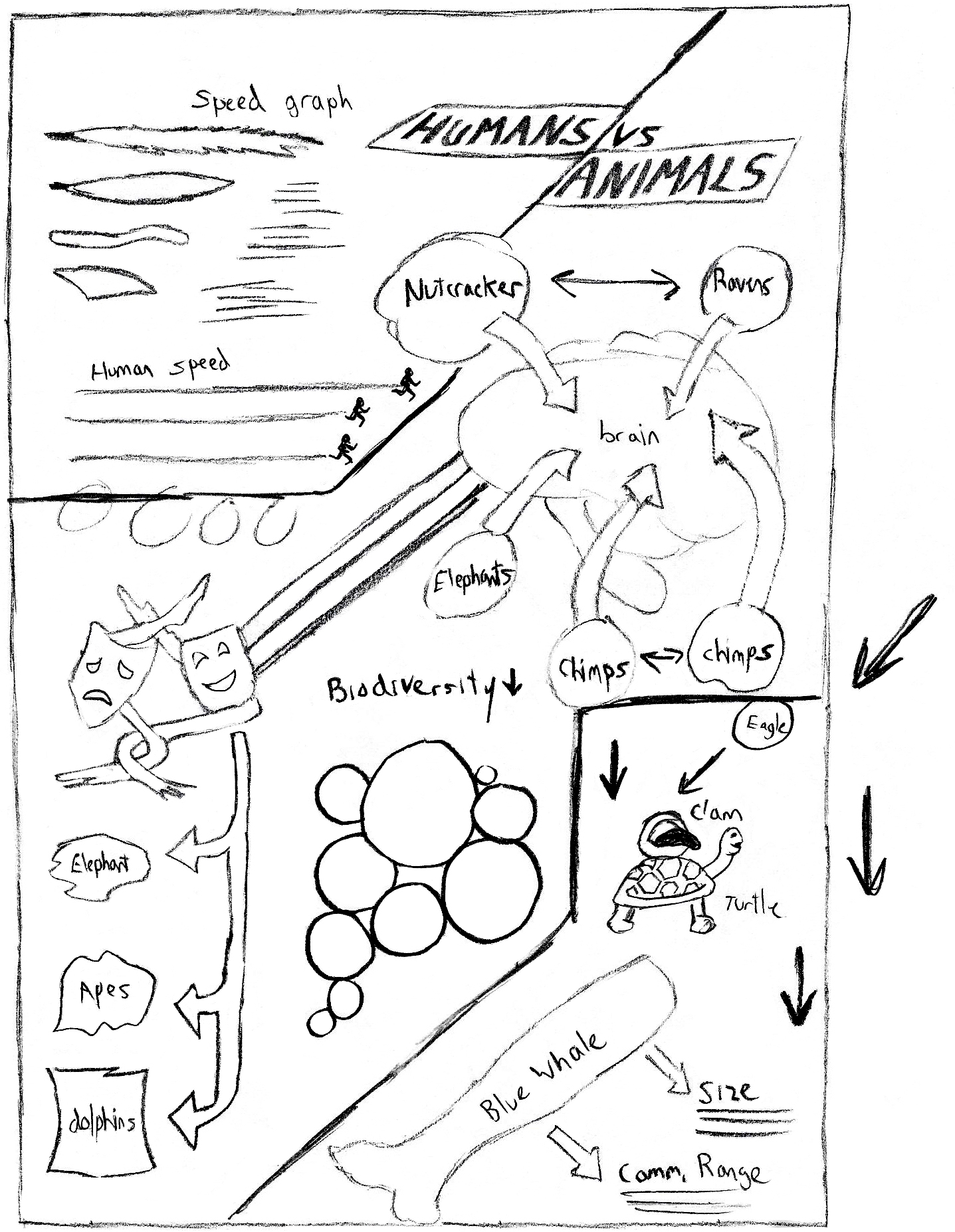
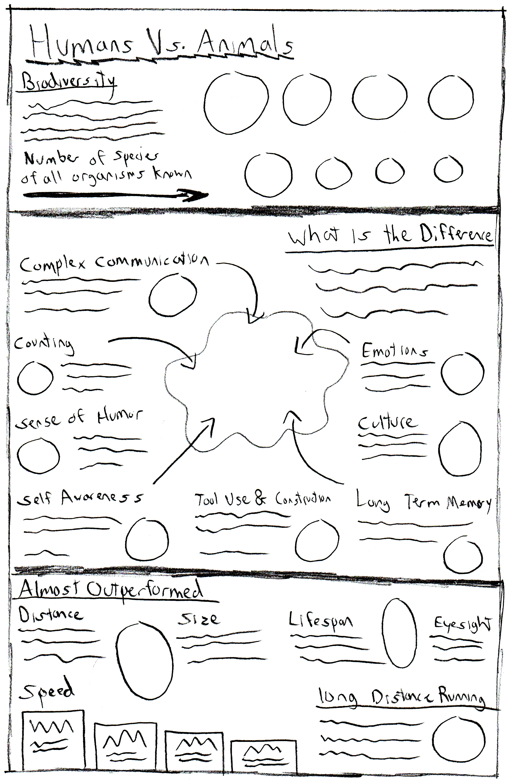
After some feedback about which layouts worked best, I developed 2 of them further. Here I added the text and created illustration placeholders to figure out the best way to arrange the information. I also tried grouping the information around similar animals. For example, 3 of the animal facts were about primates, so I grouped them all together thinking a single illustration here would work for all. This stage was also helpful in realizing how much area certain sections and paragraphs needed.
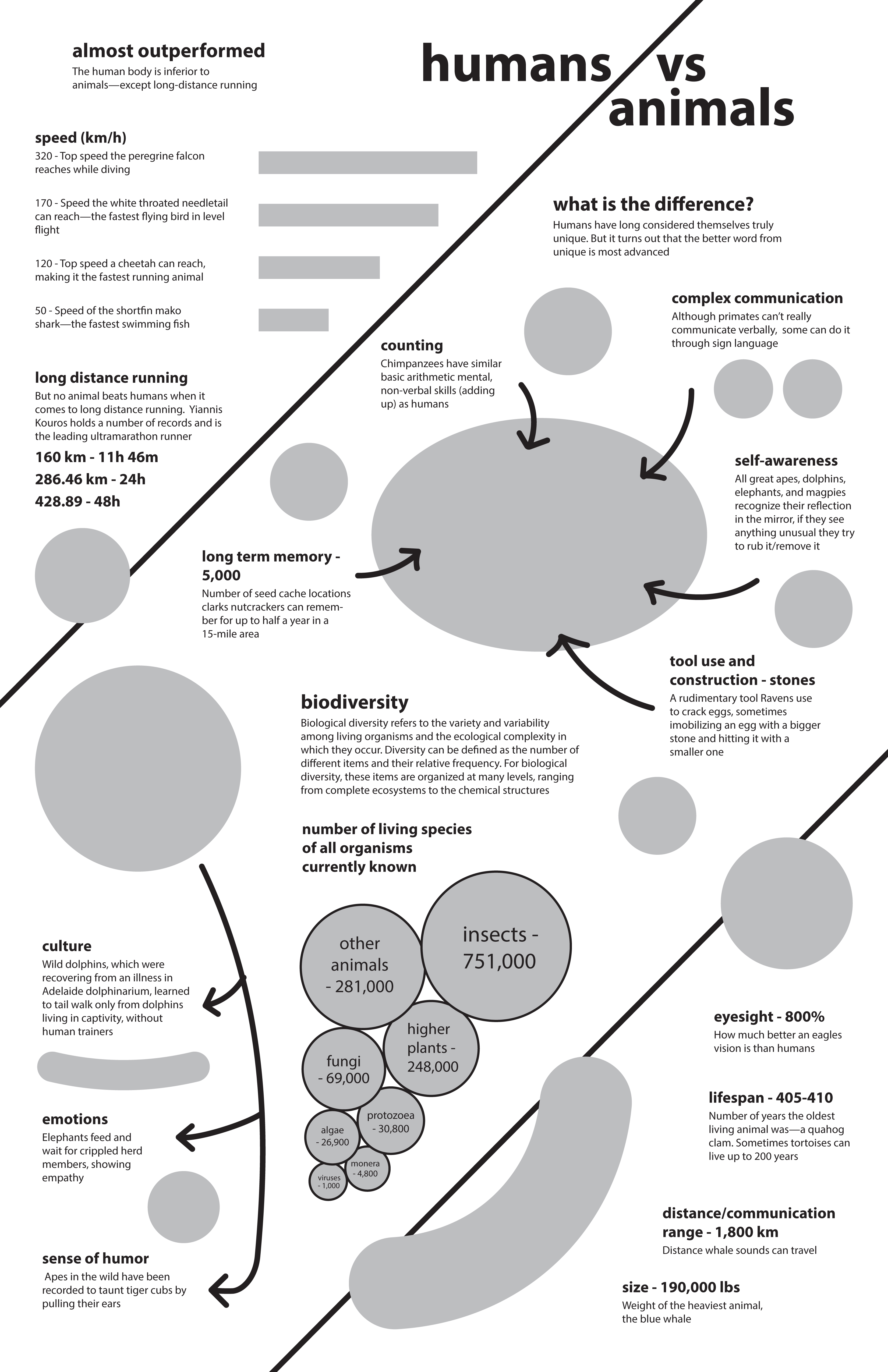
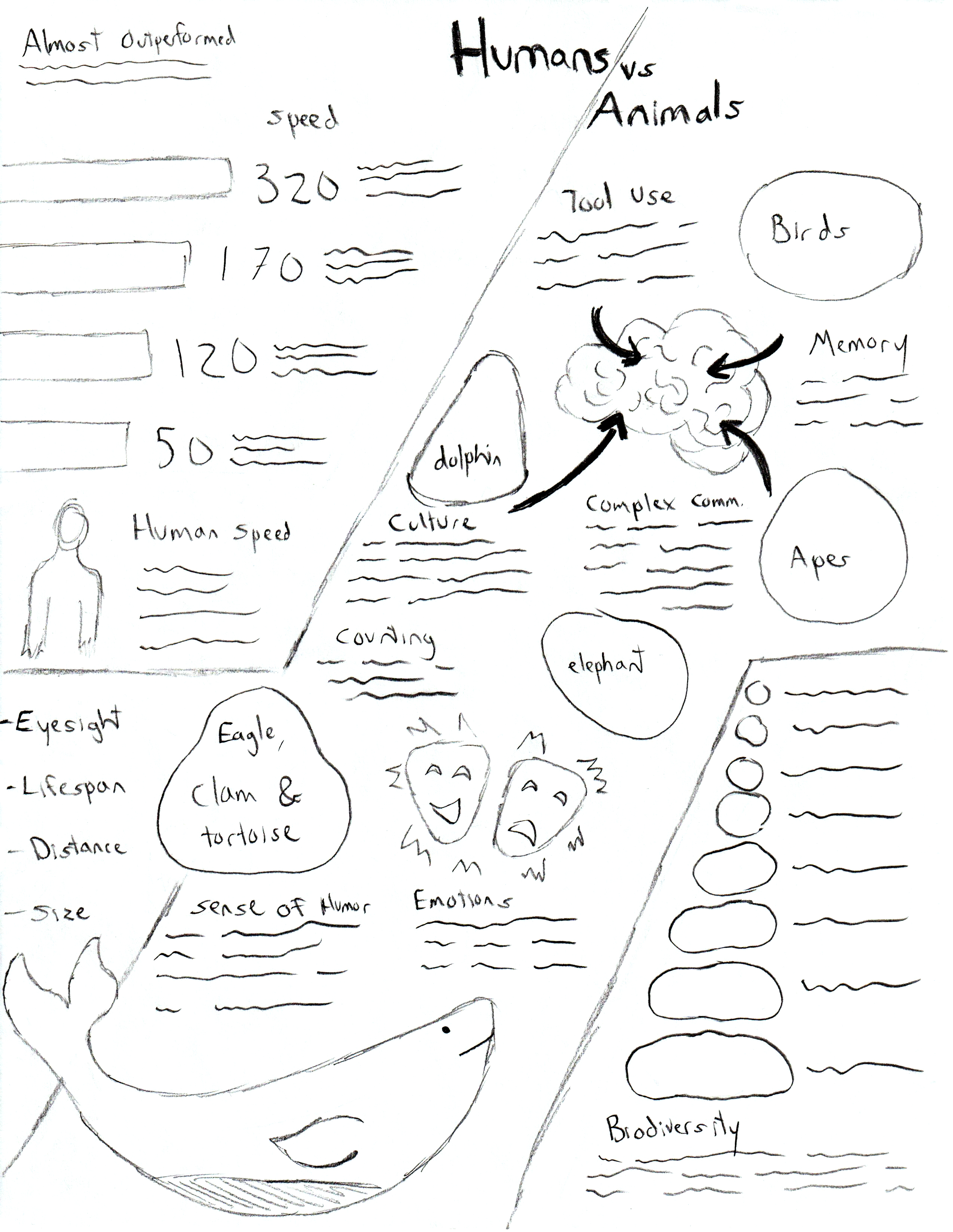
I received some feedback that the diagonal style layout was eye catching and worth pursuing, but needed some changes. Some of the issues were the Biodiversity section feeling out of place in the middle of the layout, and splitting up the Almost Outperformed section between the top left and bottom right was confusing. I drew another sketch addressing these issues that reworked some of the illustrations and section shapes/sizes.
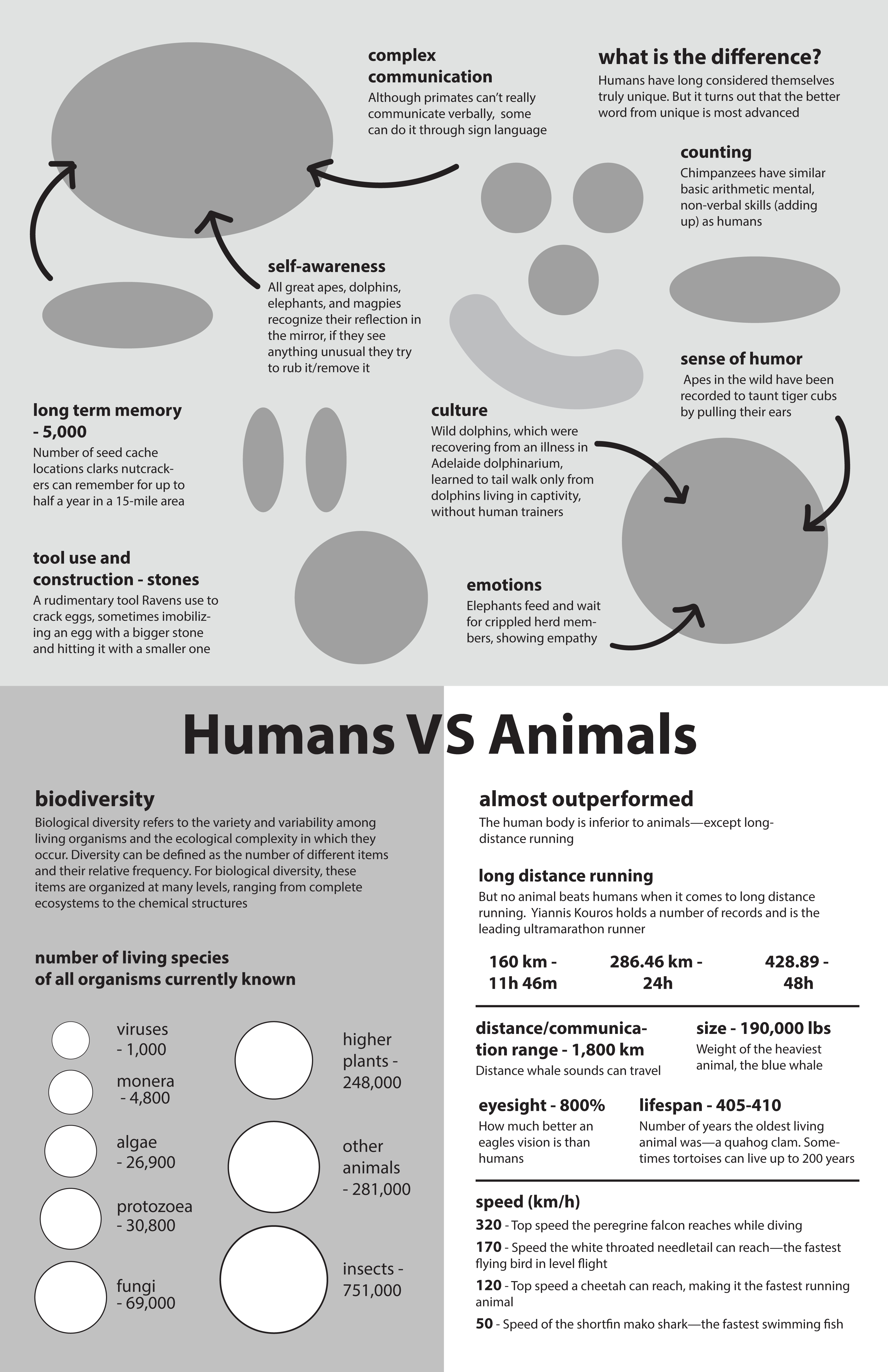
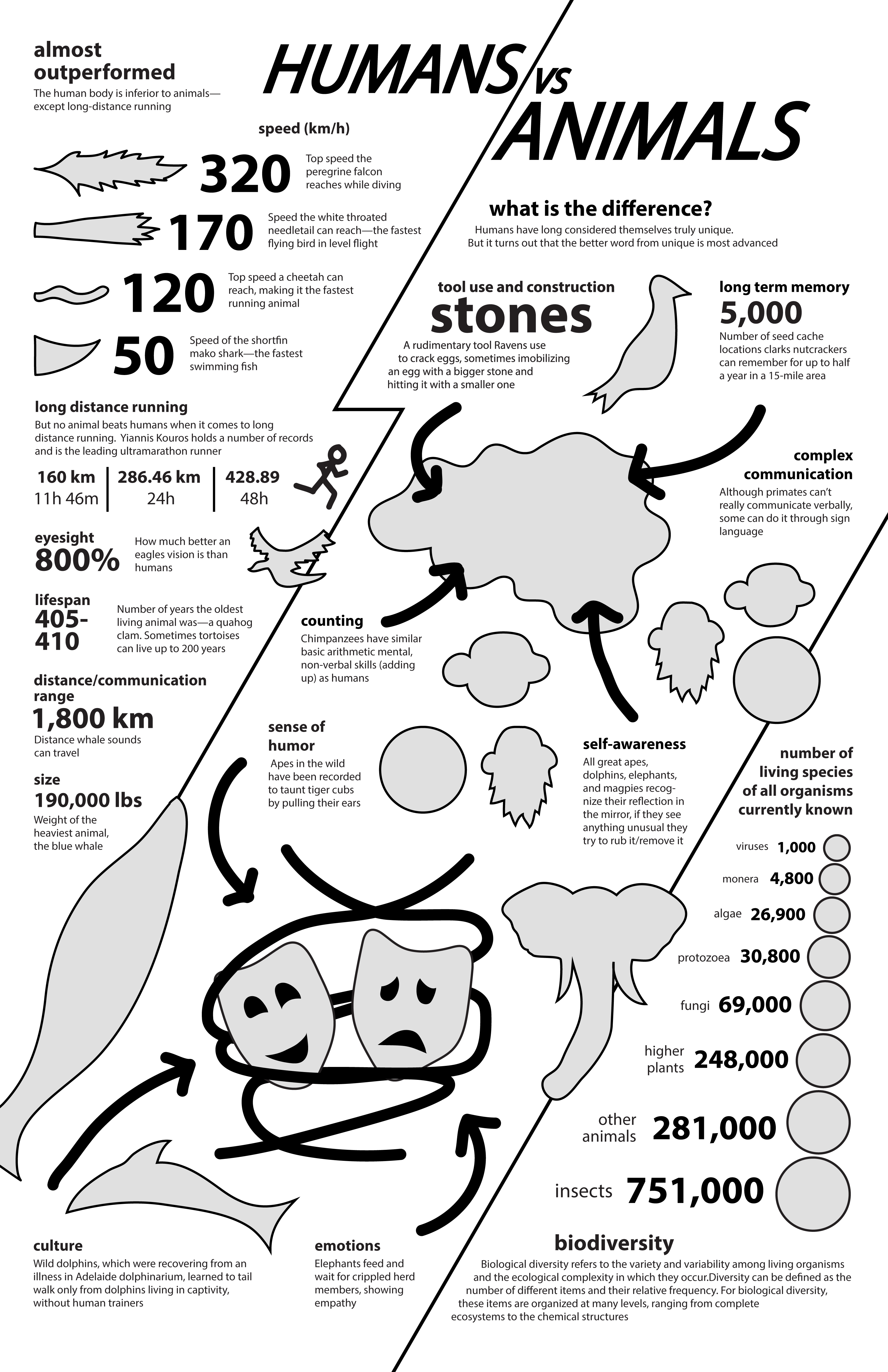
I used the new illustration to create a rough layout with text and image placeholders that were more detailed. This gave me an idea of what illustrations would be needed and exactly what shape to draw them in. This also gave me an idea of what font sizes and look the text would have. I also wanted to make sure to have any important number or statistic large in size for emphasis. Here the title was also further developed from previous sketches and layouts.
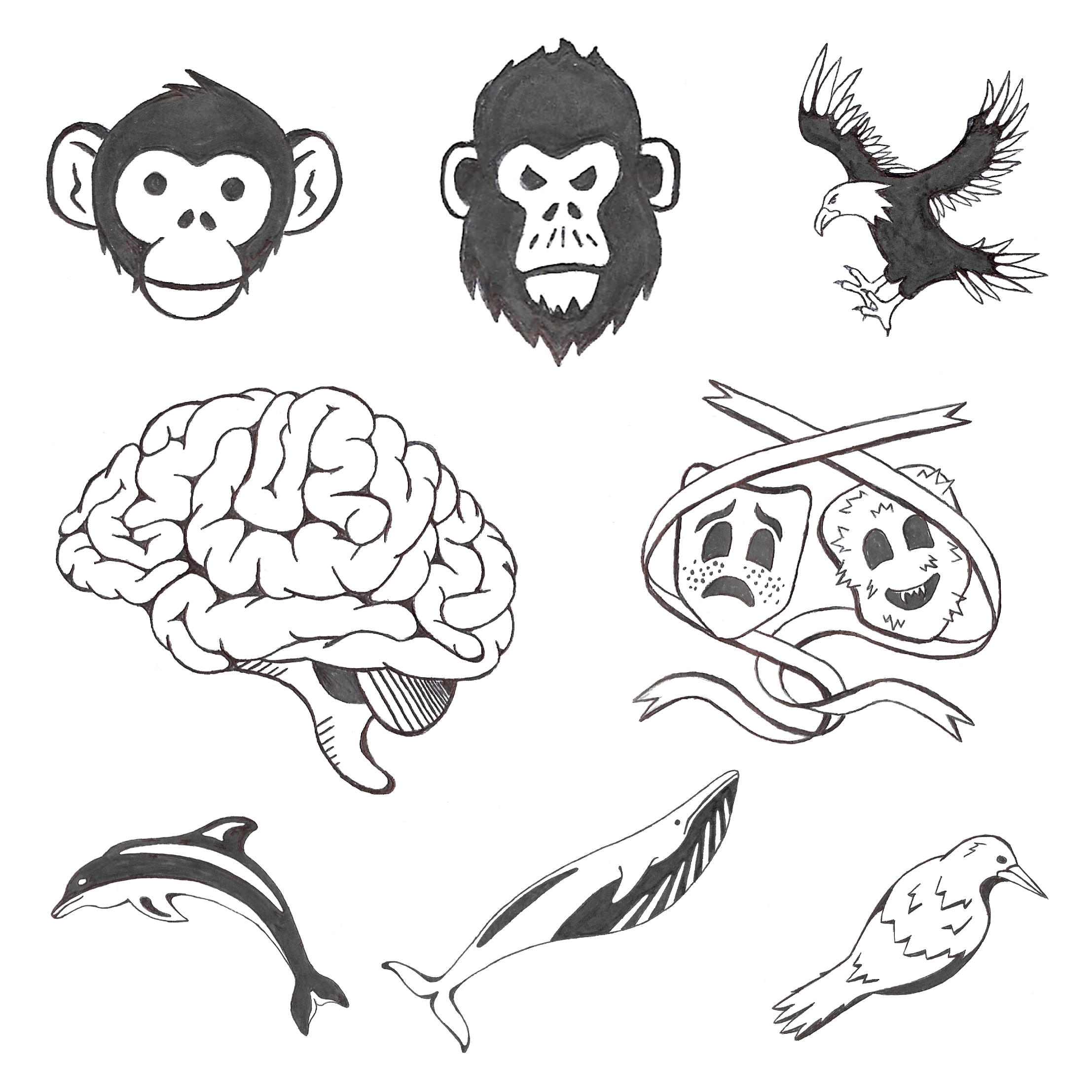
Once In knew what illustrations were needed, I drew them in marker to later be coloured in and made digital.
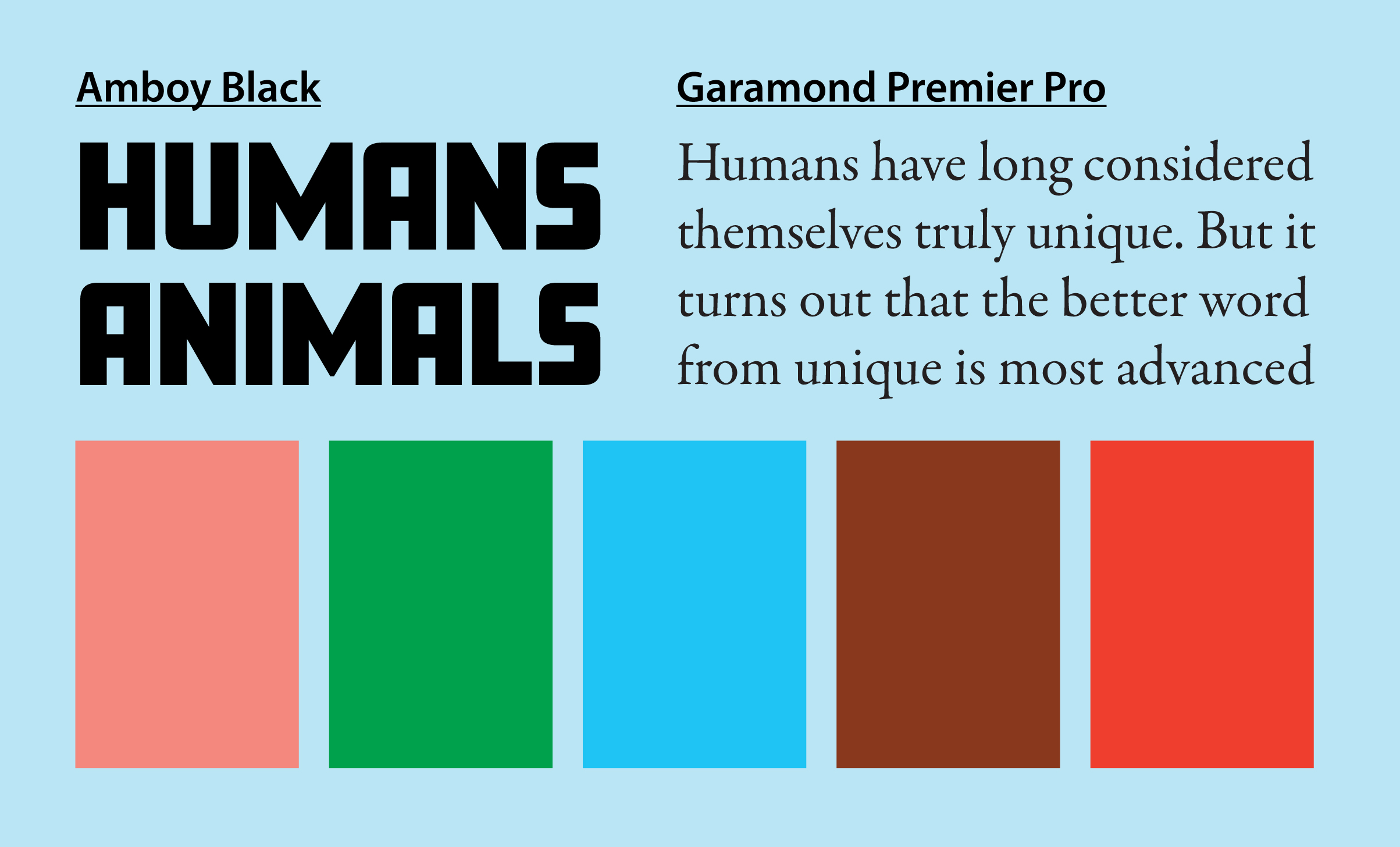
I wanted to use natural, earth colours as well as some brighter colours for contrast and emphasis. I found a pink, green, blue and brown that looked good together, and matched it with an and orange that really popped against them. I wanted to keep the typography simple, so I chose a straightforward bold font for the headings, and an easy to read serif font for the body.
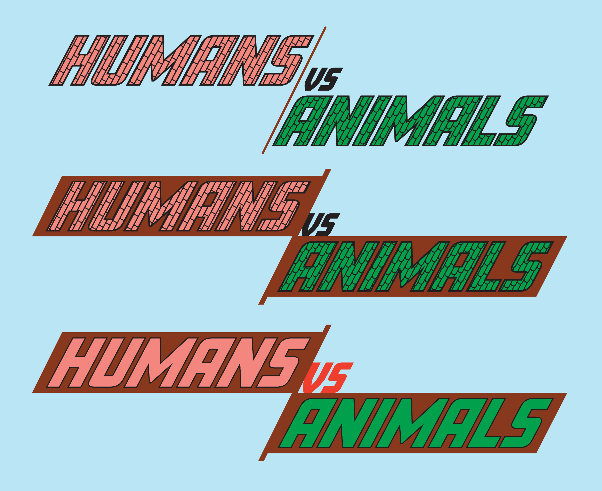
For the title, a brick style pattern was used for HUMANS, and a similar leaf/scale pattern for ANIMALS. After further infographic iterations and feedback however, this was removed for a cleaner, more legible solid colour look. The brown background also helped with readability and visual interest.
Version 1 turned out successful in some aspects, but still needed a bit of work. The variety of illustrations and colour harmony worked well to create an attention grabbing design. Using the orange and green colours to emphasize important statistics and unify the section titles worked well. Aligning certain elements helped to create structure, while letting some areas float free added excitement. Having some illustrations break out of their sections also created a more dynamic look.
The text in some areas was too close to other elements or looked awkward so that needed fixing. The title was also a bit messy and hard to read so that was fixed as mentioned previously. The bottom area seemed a bit empty as well, and the Biodiversity section needed to be scaled, aligned and spaced in a more pleasing way.
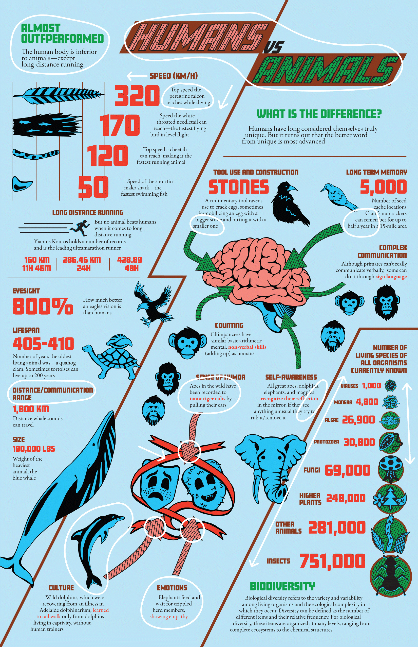
Shown here are the changes made to the first version to create a final version that was deemed successful:
The feedback I received was positive, and the project was successful in relaying information in an understandable, easy to read, unique, and eye-catching way. Anybody looking at the infographic can easily see the information divided into distinct areas, and are immediately intrigued by the emphasized numbers, leading them to read more about what the numbers represent. The illustrations and colour harmony also help to pull viewers in.