
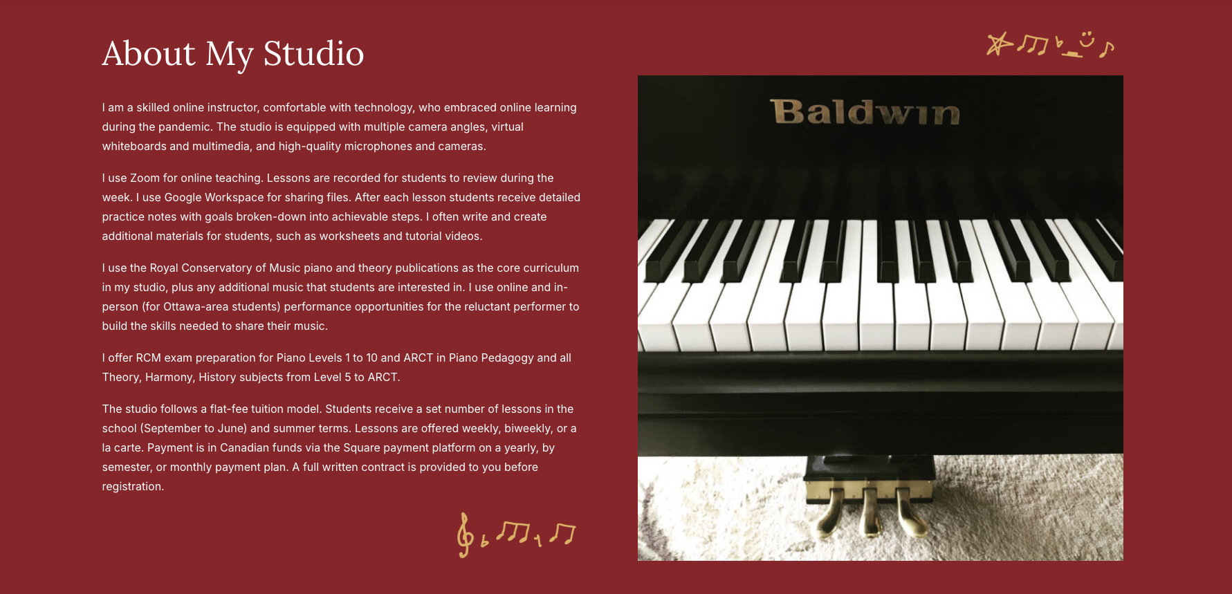
This project was website I created while working as an intern for Percolator, an ottawa design agency. The client was a piano teacher who needed an updated site as the current one was very basic and outdated. To build the website, the client wanted to use a website host they were familiar with, that also had a built in site builder. I built the entire wesbite myself; from initial ideas, rough prototypes, client feedback/changes, to the final result. It was a satisfying and comprehesive project that the client was very happy with.
First I met with the client to go over their issues and what they wanted out of the redesign. They requested "brighter" website with larger sections and type sizes. A focus on online teaching with images that reflected that was important. The client also wanted more persuasive language and call-to-actions sections encouraging potential students to sign up, as well as showcasing the clients versatility and variety of offerings. There was also an original brand guide to work off of which was helpful. We needed to have strong, consistent branding as the client also wanted to implement social media, as well as printed materials.
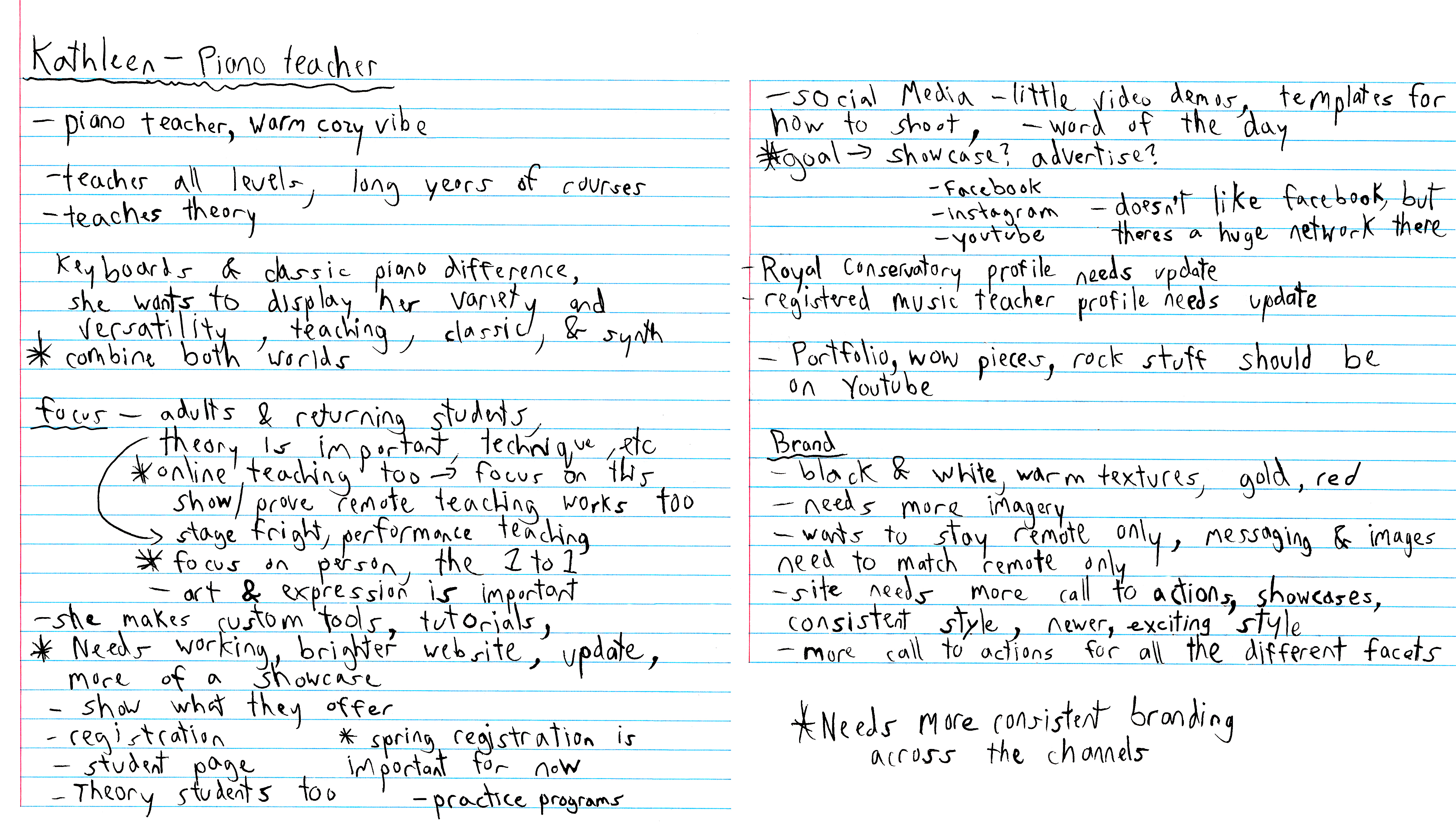
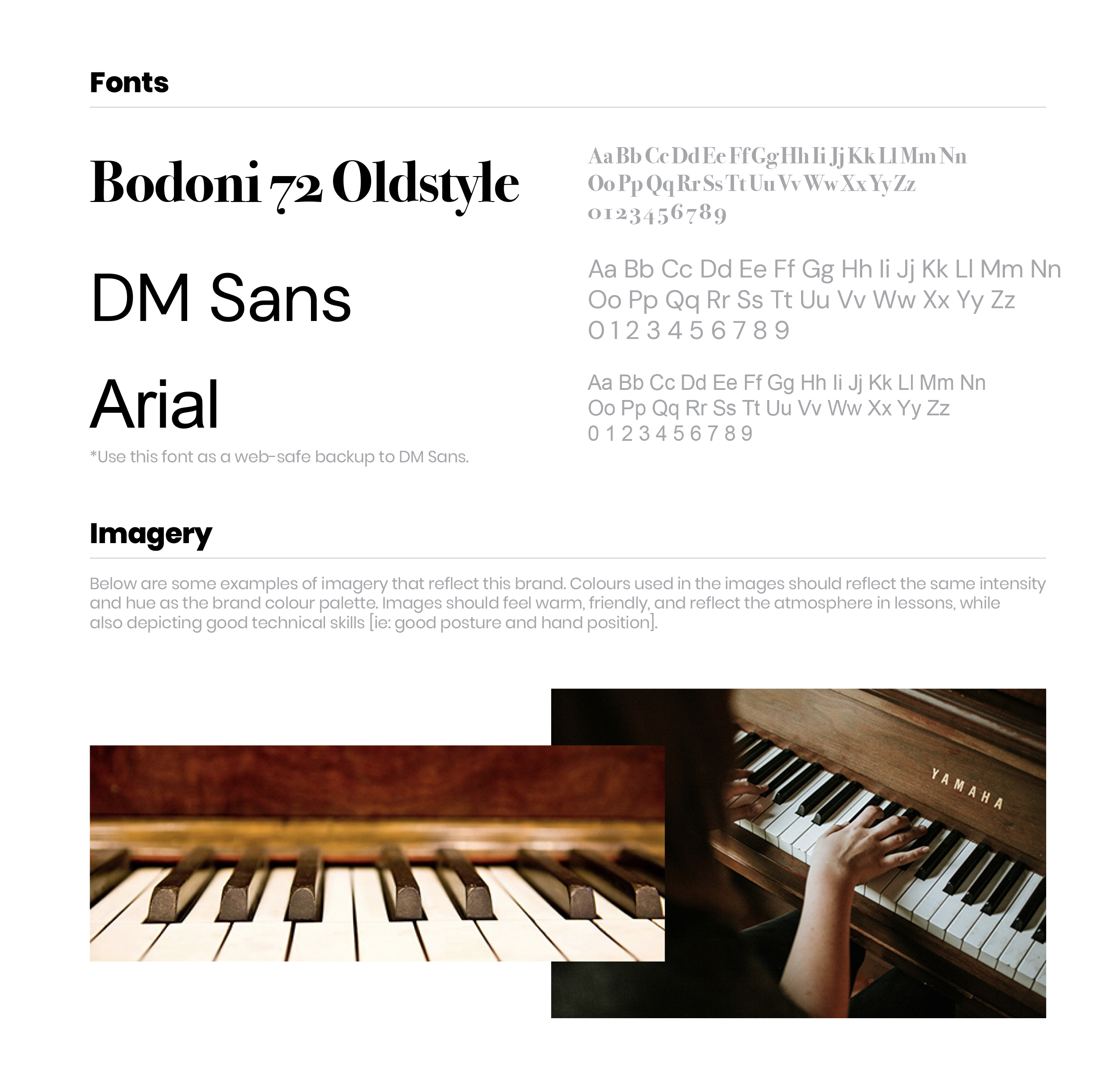
the old site functioned fine, but was very basic and needed to be more visually appealing. Creating a more focussed message was also crucial. I familiarized myself with the original site, client notes, updated website text, and brand guide to create a solid starting point for the new site. Referencing the logo variations, colours, typefaces, and imagery style was very helpful.
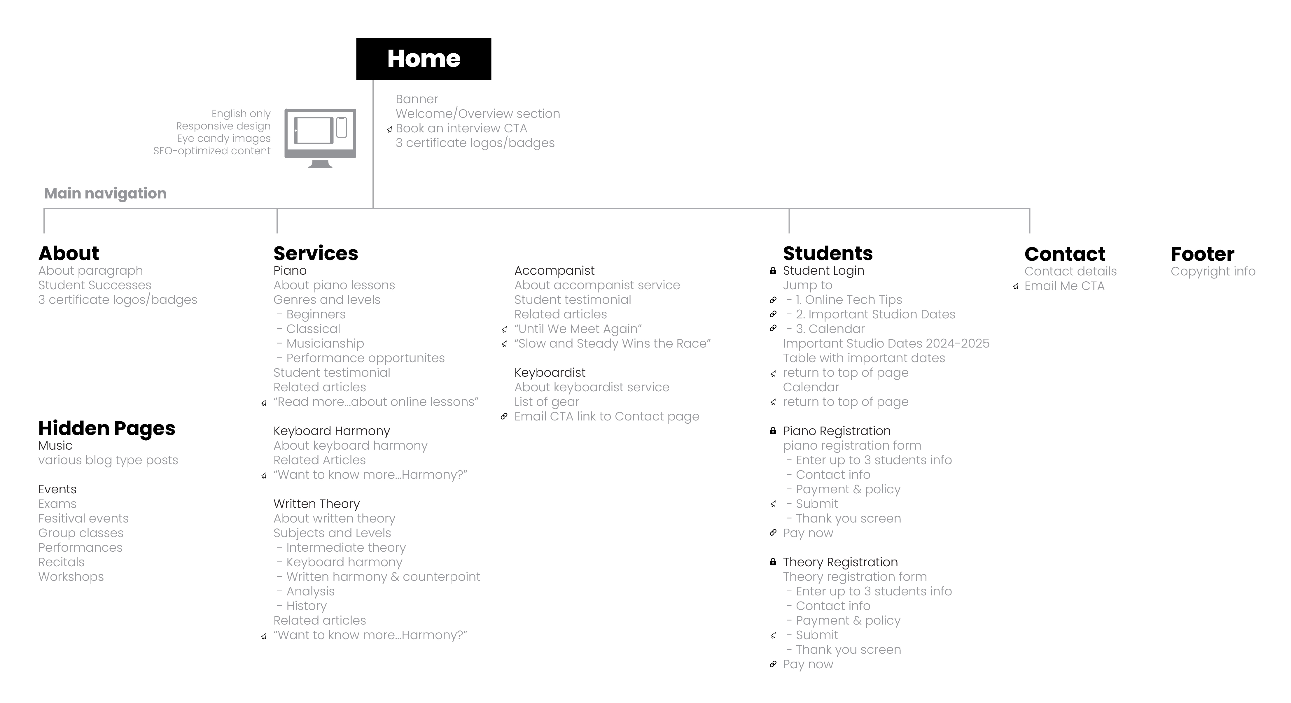
I used the word the updated site content to make adjustments to the exsiting site map to get an idea about the number of sections, their location and order. Some of the changes involved
moving the Services section right after banner on the Home page to pull in potential customers easier. The Welcome section was also moved below the Services section. A new Benefits of Online Lessons section was added for further promotion. The blog type posts were removed completely from site as well to keep the websites message concise.
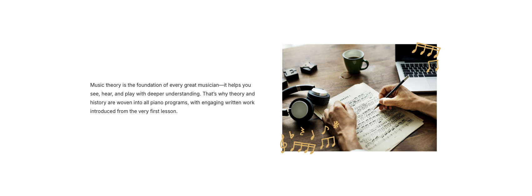
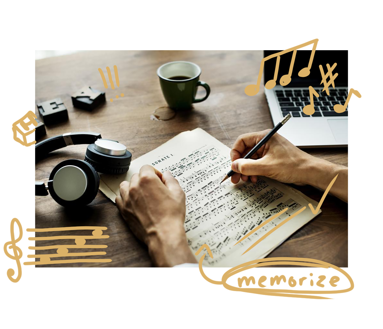
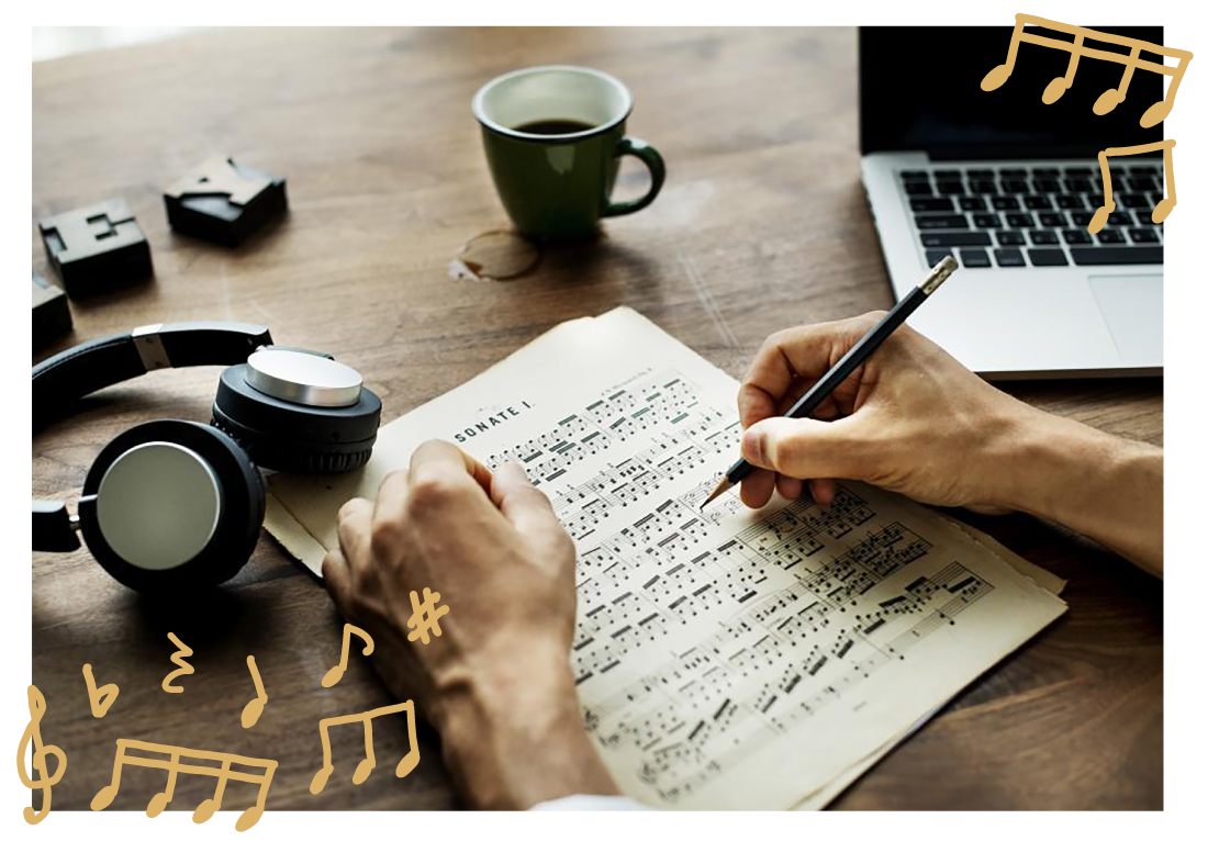
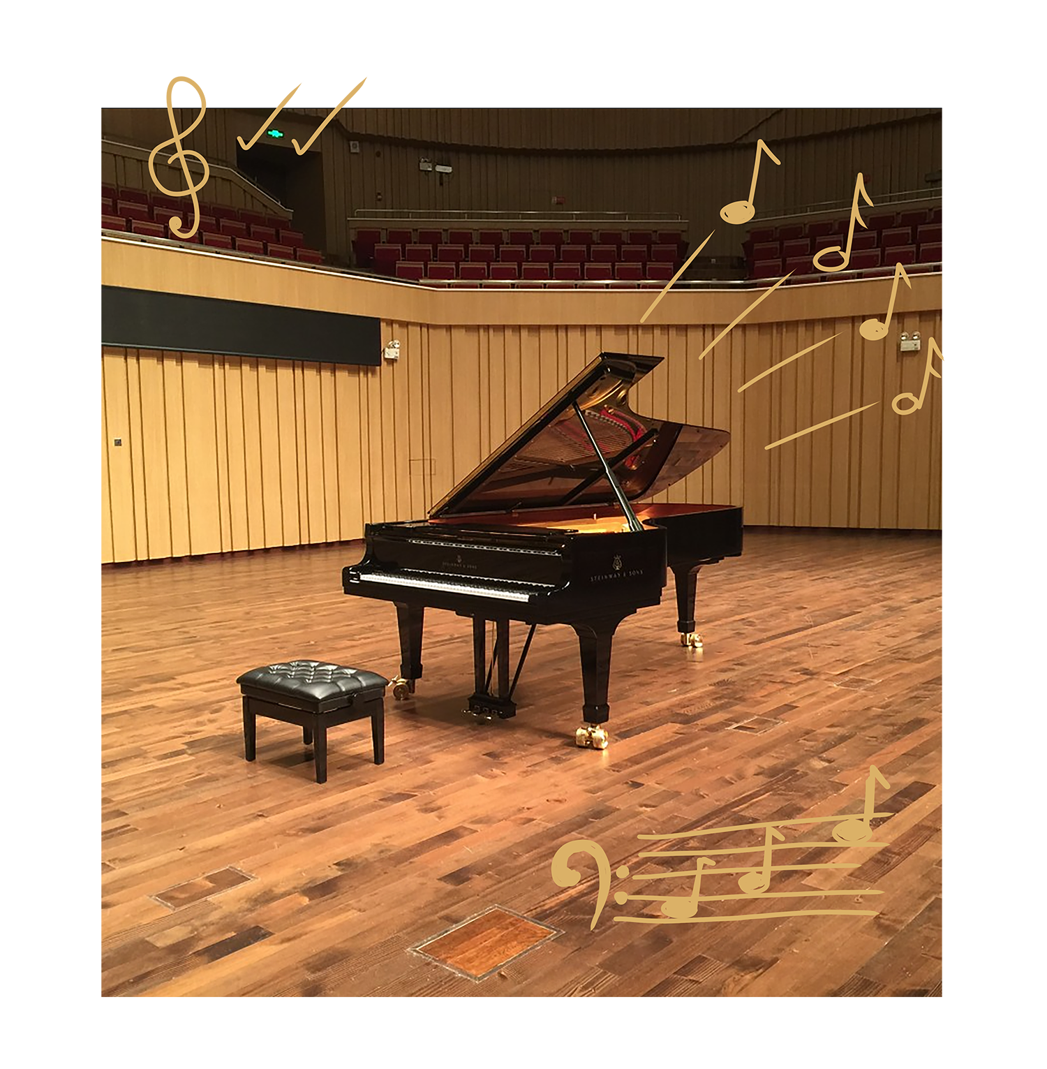
The client also provided further notes and important things to keep in mind when building the new website. I also began coming up with ideas for new creative elements to incorporate into the site. Teacher style markings like circles, arrows, scribbles, and small encouraging phrases to accent the images was considered. Ribbon-like graphics curving around images to reflect the flow of music was another idea I had. Using the red smoky background texture from the original sites banner and brand guide to use in an emphatic way was another potentially useful idea.
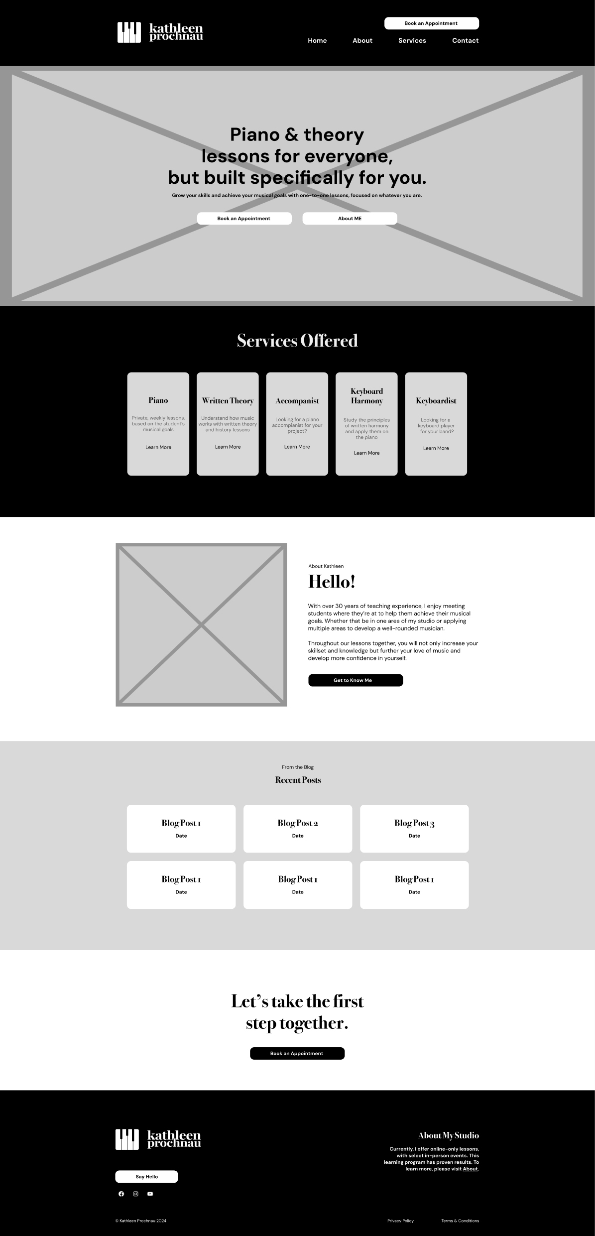
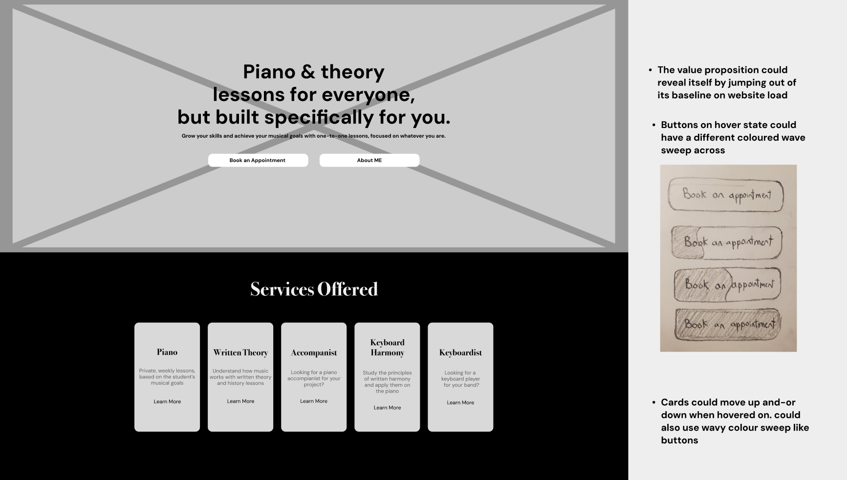
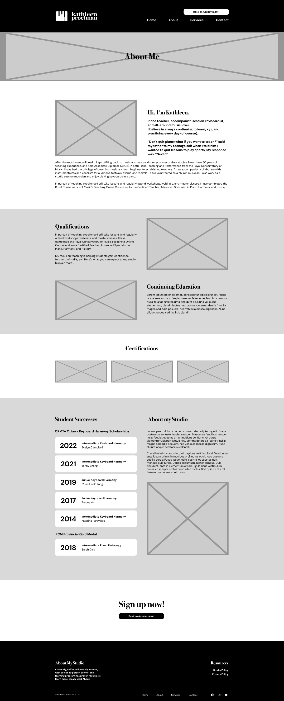
The first step was to create black and white low fidelity wireframes of the pages, to get a feel for the layout and look.
Referencing my notes, the brand guide, site text file, original site, and my own ideas worked great as a foundation to start creating the new website.
The client was happy with the homepage, but wanted their social media icons added somewhere on the page, as well as a call-to-action section at the bottom encouraging the viewer to sign up.
Some ideas I had were to reveal the banner text popping up in a cascade, like piano keys being played. I thought this animation style would also work great for the cards in the Services Offered section. I ideated that the buttons could have a colour sweep animation when hovered over, but Percolator thought that might not work considering the restrictions with the clients chosen website builder. Percolator also wanted me to try moving the social icons to the left, and a Say Hello button added that would link to the email.
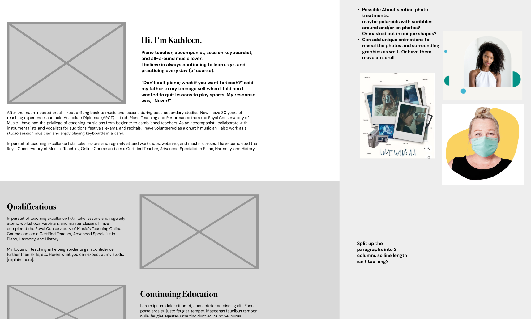
While building the About page I had some ideas for the imagery, like using the teacher style scribbles around and overlaid on the photos, or maybe cropping the images into unique shapes and and incorporating blocks of colour to give the site a modern, welcoming look. I thought I could also animate these ideas to appear when the user scrolls into view. However, the client wanted to keep things relatively simple and to stick with the doodle style design.
I decided the Qualifications and Continuing Education section would be easier to read and function better split up into 2 rows with accompanying images. The feedback about this was positive.
I also got a note that the client might not want to include the Student Successes column, so I might have to rework the About my Studio part as its own section
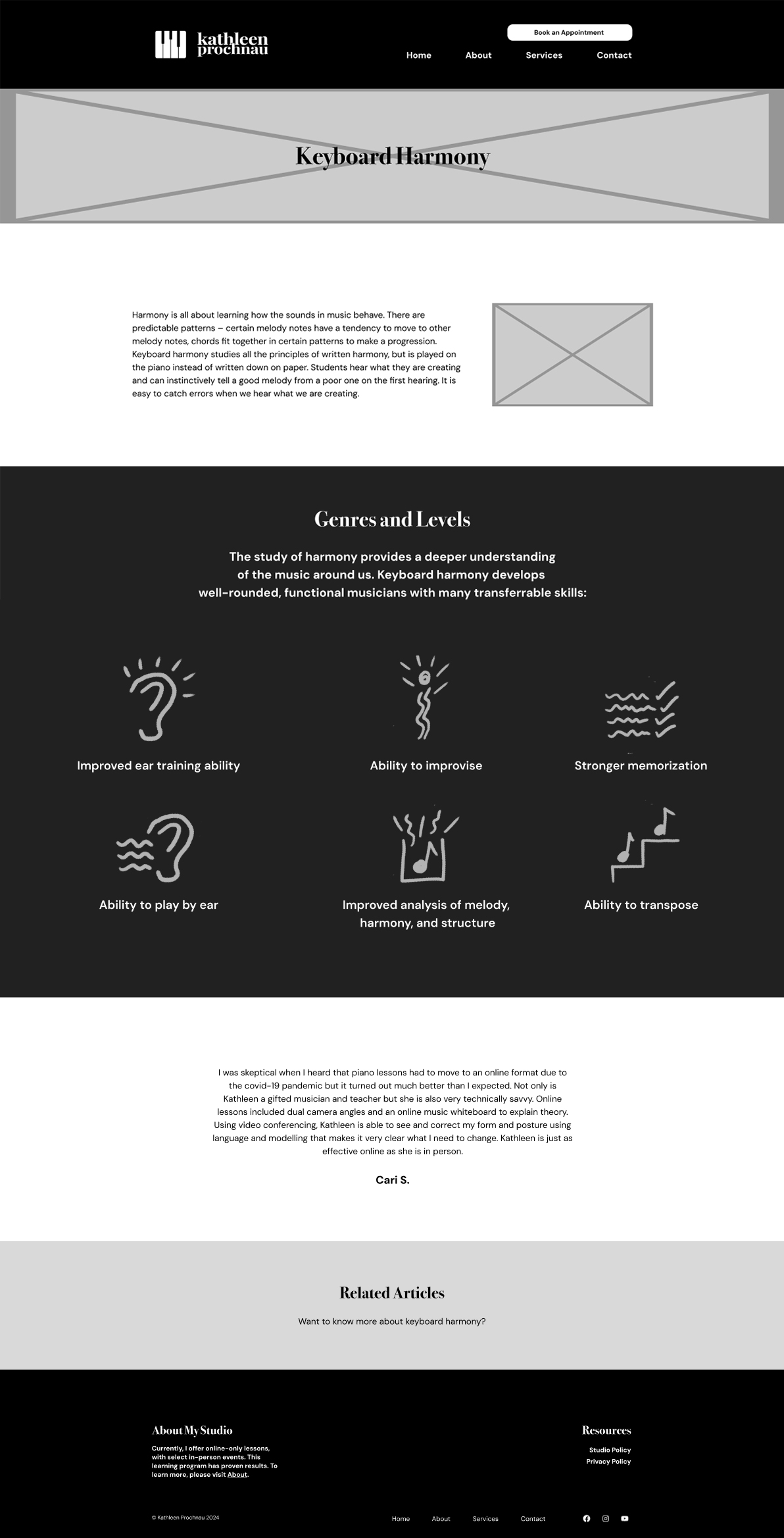
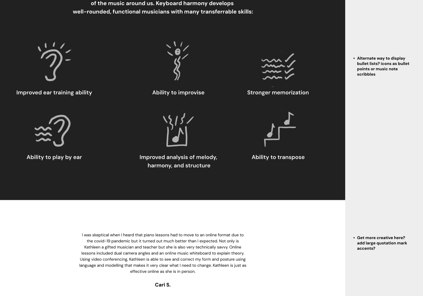
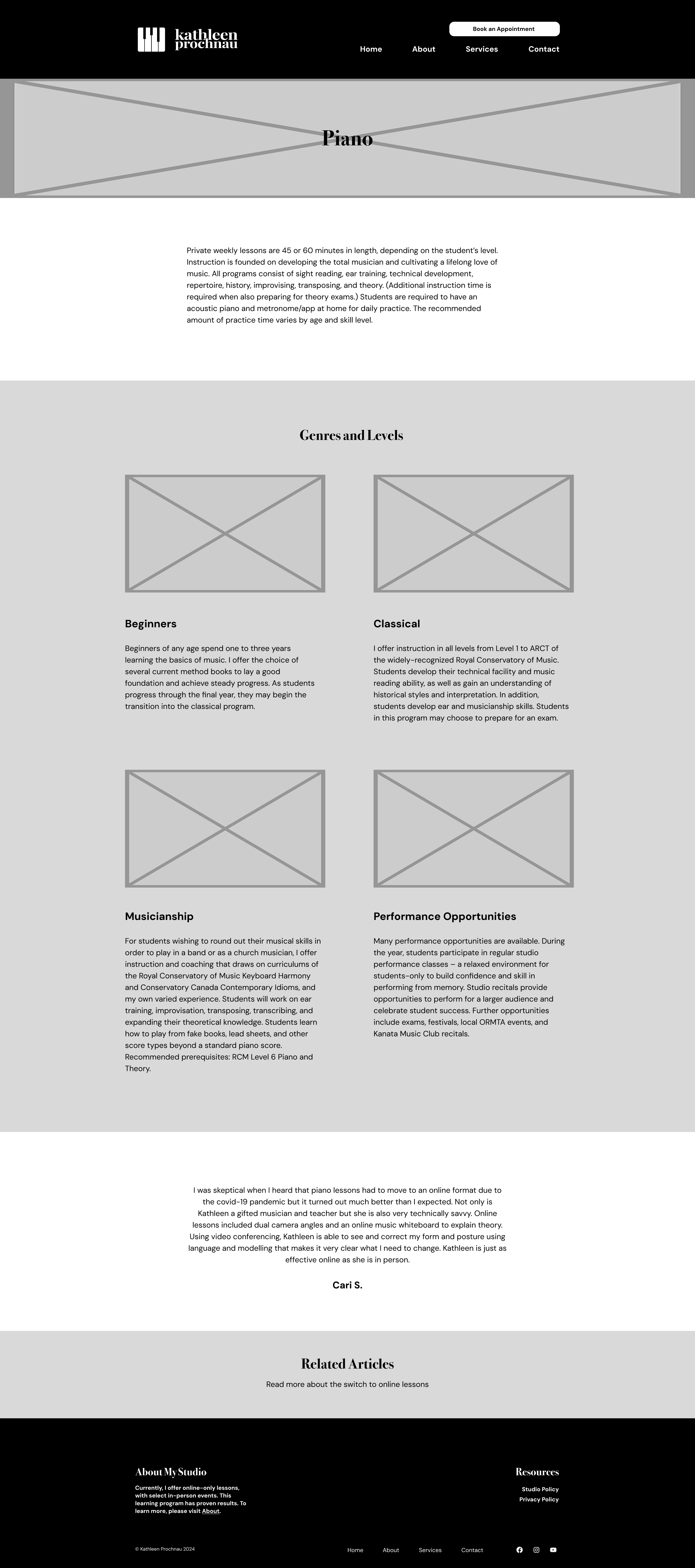
For this page, the Genres and Levels section was a bullet list originally, so I wanted to come up with a creative way to display the information. I thought it would fit with the scribble theme and be visually helpful to hand draw icons for each list item. I came up with my own doodles that i felt represented the text in a simple but effective way.
The quote section seemed bit uninteresting, so i thought I’d try to add some visual accents to frame the text nicely for the high fidelity wireframes next.
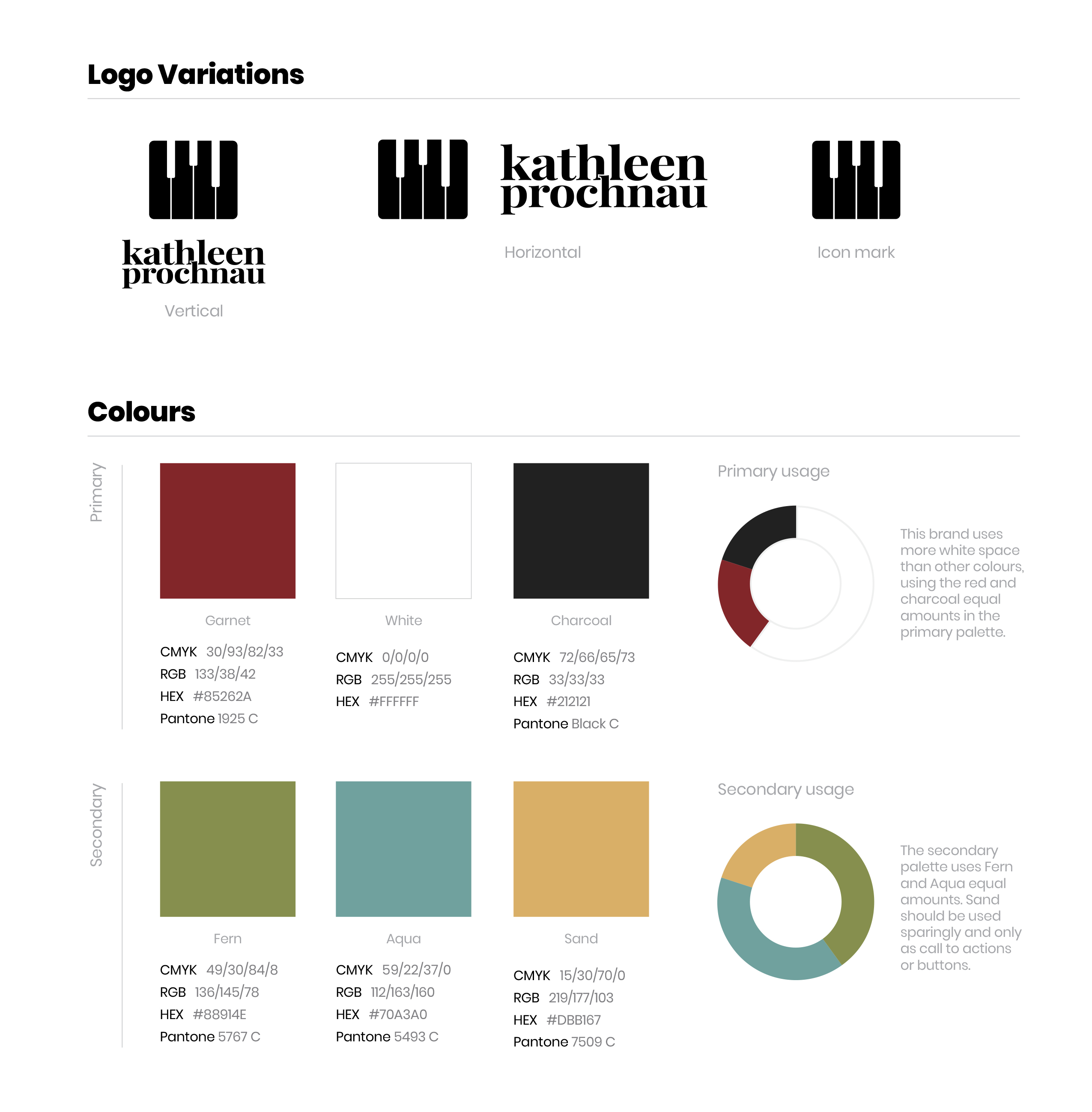
Once the client was happy with the low fidelity wireframes, I started making full colour high fidelity wirerames. While working on the new pages, I created a style guide to show Percolator and the client for easy feedback and changes. The guide also helped organize and keep the design consistent across the site.
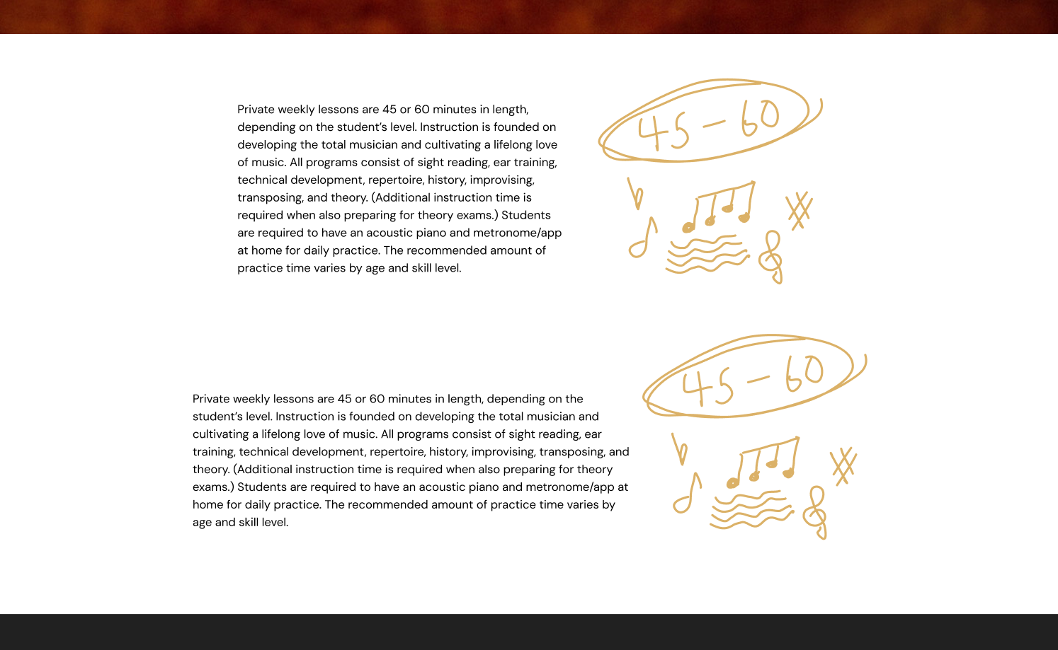
The client liked the red smoky background from the previous site design and wanted to keep it as a banner, so I made sure to include that. The guide also includes an example of imagery style and how the doodles could work with it. I picked a 1.25 type scale so there was enough of a size variation between the headings but also wasn’t too extreme. I made the buttons thin and rectangular like piano keys, planning to have colour fill in as the user hovered over them. I drew some scribbles as well to be used as icons and as accents with the photos. I thought drawing circles around the ones to be used as icons would work to keep them more distinct and more uniform in size and shape.
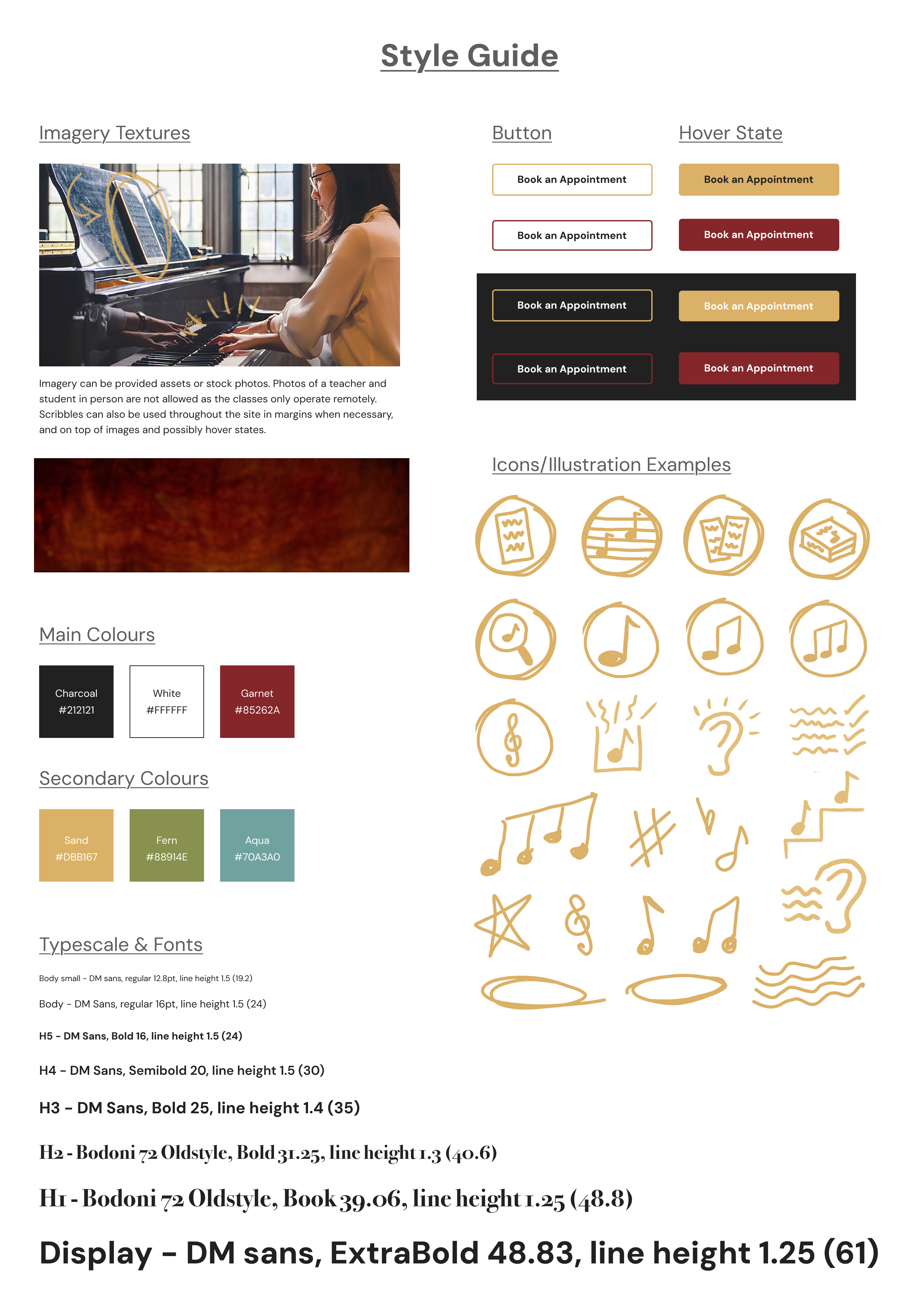
- Percolator and I decided to only do high fidelity versions of the Home, About, and Piano pages since a lot of the section designs repeat on all the pages, and I had a solid style guide to build off of anyway. This would also streamline the project so I could start building the site as soon as possible.
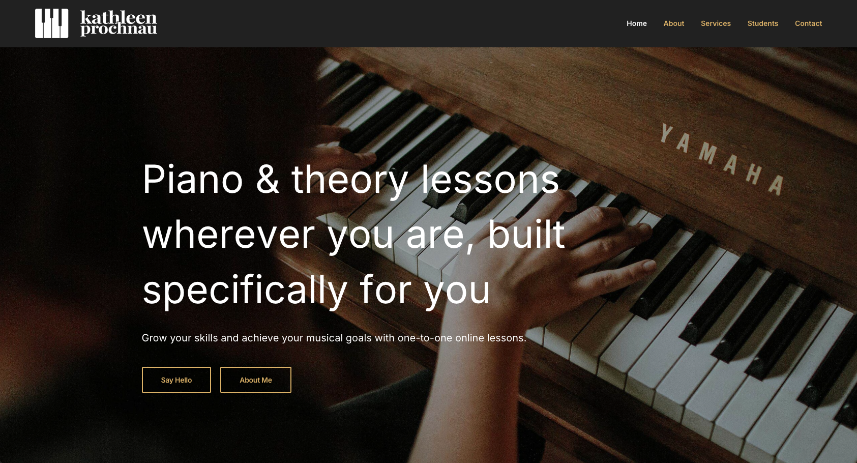
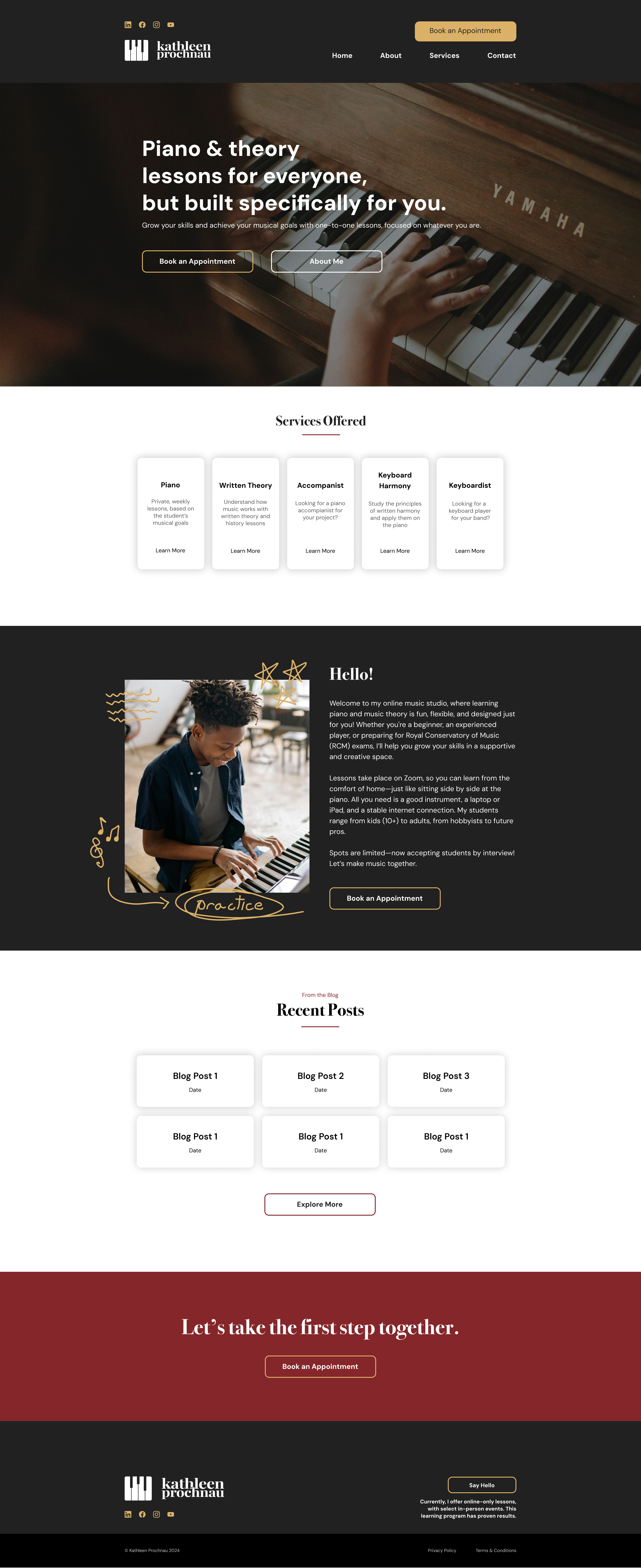
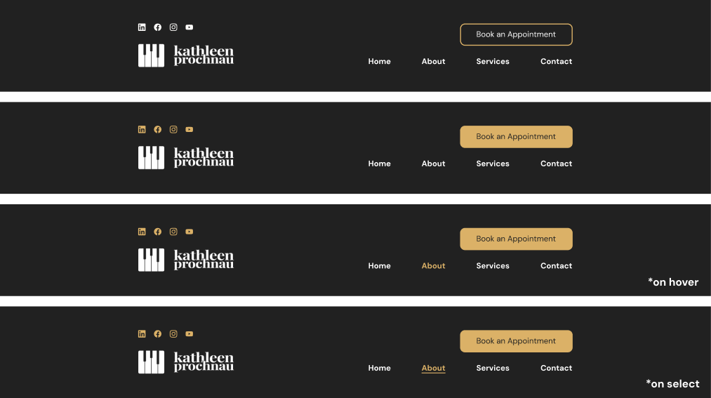
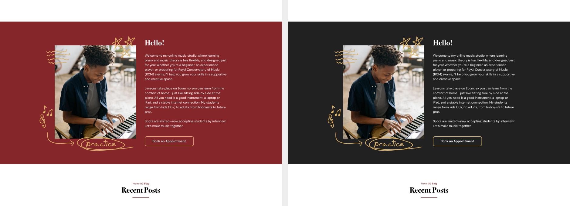
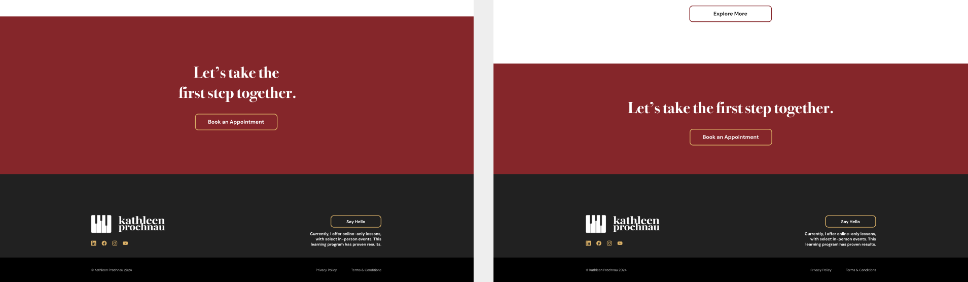
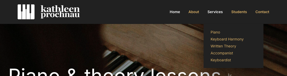
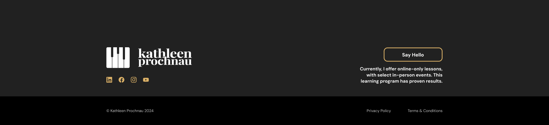
For the high fidelity version of the home page, social media icons were added to the navigation that linked to the clients Linkedin, Facebook, Instagram, and Youtube pages. The banner uses a photo the client provided and wanted to use, and the elements are left aligned as it works better with the image. A small underline was implemented for the section subheadings, and drop shadow was added to the cards for contrast. Doodles were added to Hello! section image, and the text was also updated by the client. The call-to-action sentence was altered from two lines to one line as it looked less squished without a line break. As for the footer, sizing and spacing was altered to be more cosistent and cleaner. The button here was also moved to the right to create better balance and the text was refined to remove unecessary information.
Before the hi-fi versions were finalized as shown in the previous part of this study study, Percolator wanted to see some alternate versions and changes.
The social icons in the navigation were originaly white but changed to gold to make the logo stand out more, and the button was changed from an outline to a fill to be more attention grabbing.
The background of the Hello! section was changed from the garnet colour to charcoal for better contrast and colour harmony.
We also agreed red worked better when used less often across the site, or as as an underline or button colour instead.
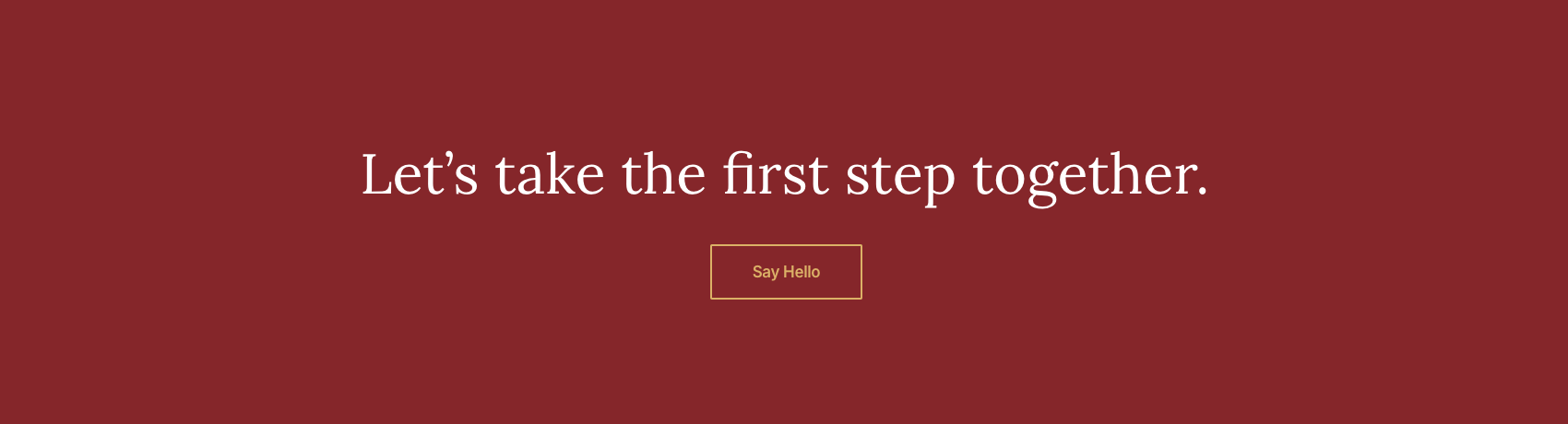
The call-to-action section looked better with a smaller height, and with the text as one line as mentioned previously. The red also felt loud and eye-catching as a background colour to use sparingly for extra noticeability.
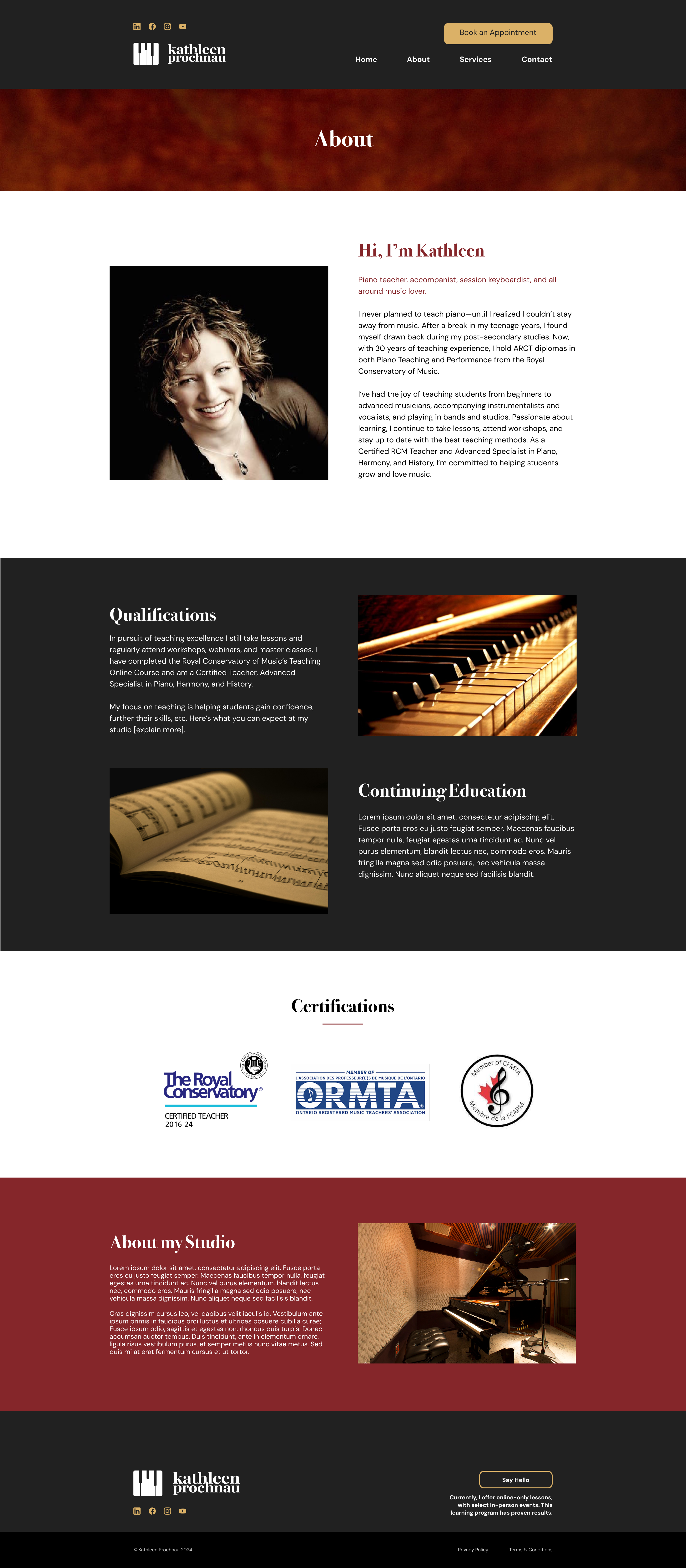
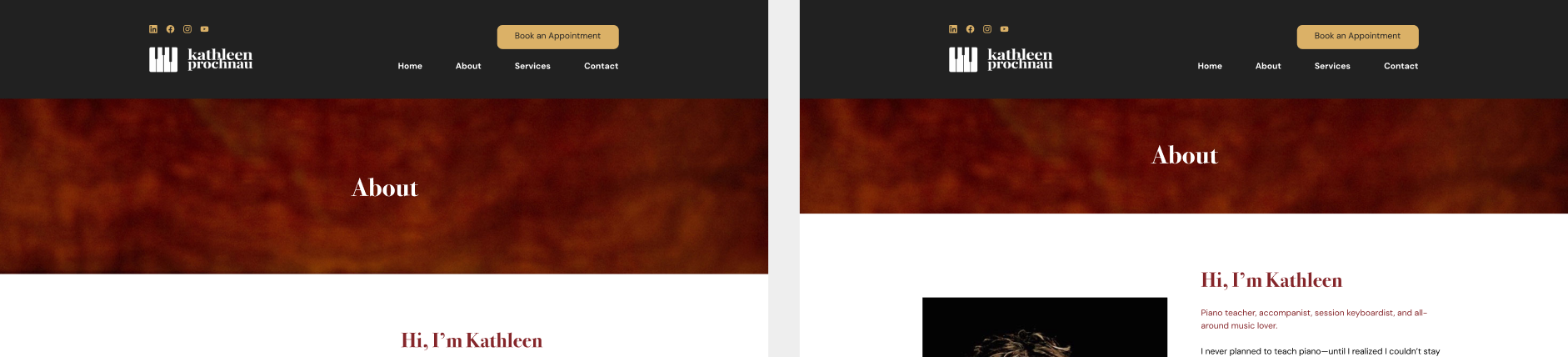
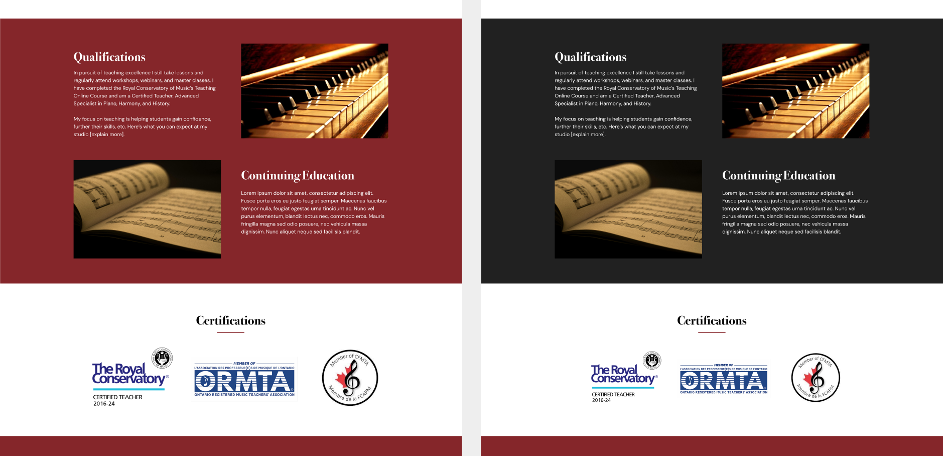
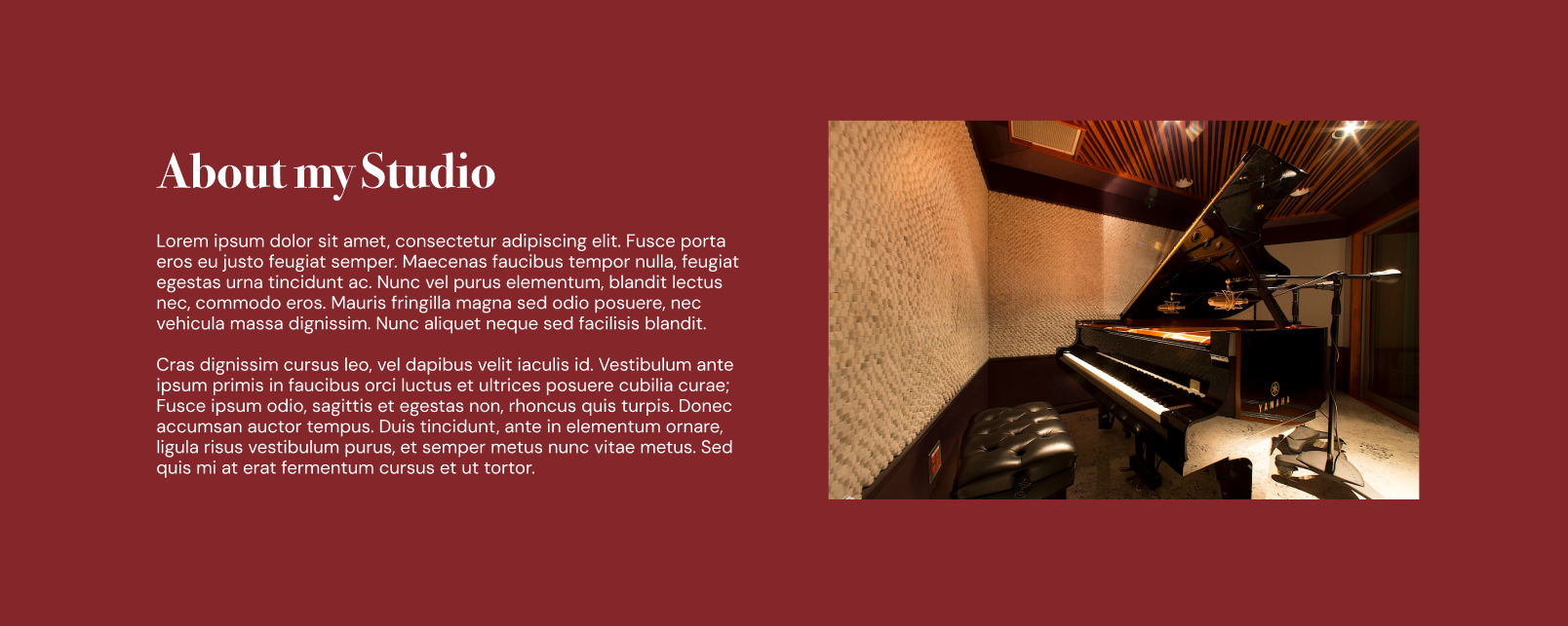
There weren't a lot of huge alterations on the About page for the first couple of sections, but there were significant changes in the bottom sections. The introductory section was altered into two columns instead of a text wrap as it looked cleaner. A new photo that the client provided was also added. Stock images were introduced to the Qualifications & Continuing Education section that matched the clients request for warm images. For the About my Studio section, I removed the Student Successes part at the clients request, and the remaining elements were put into two columns to stay consistent with the page. The Sign up now! section was removed as it felt uneccessary for this page.
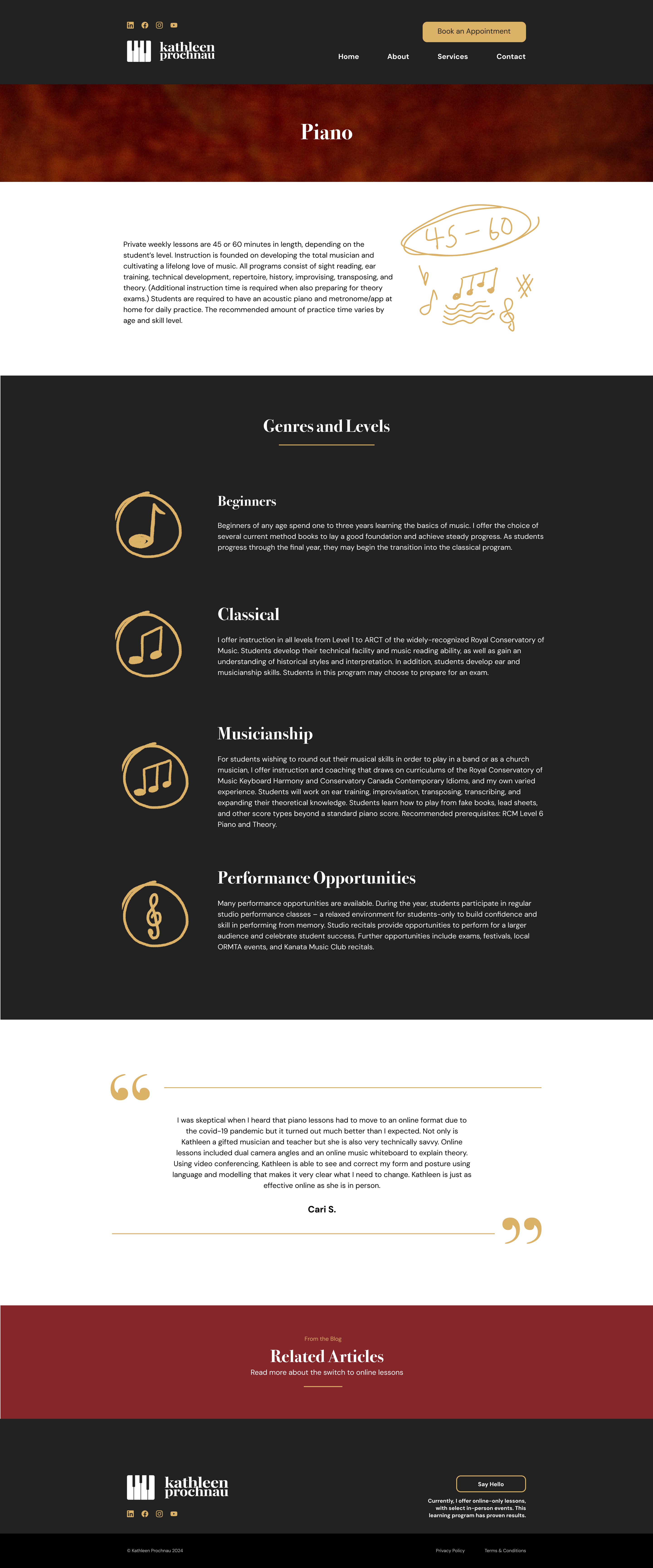
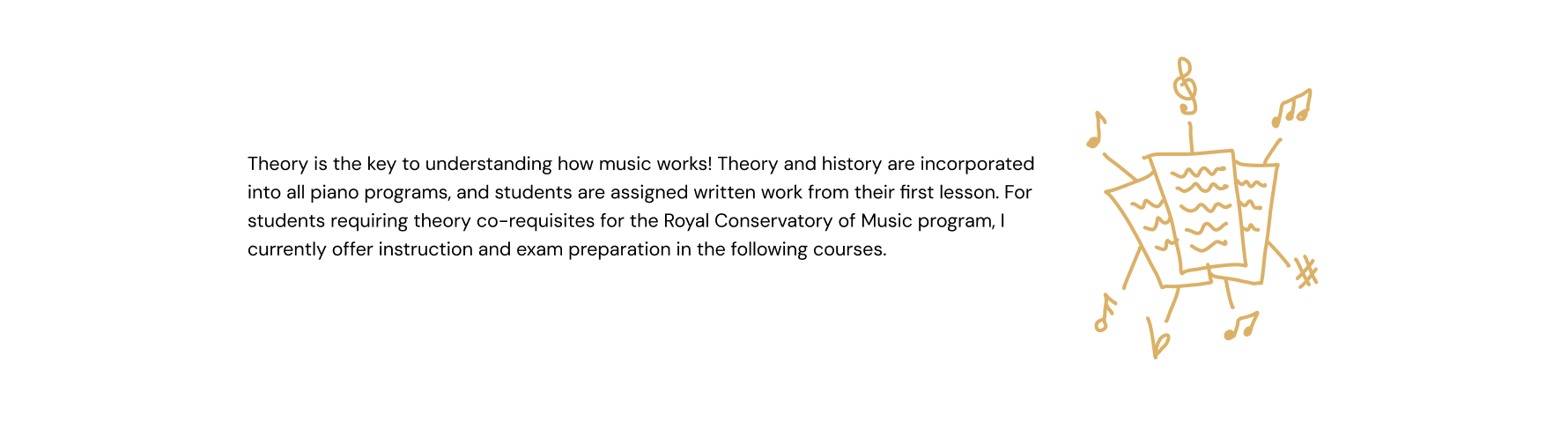
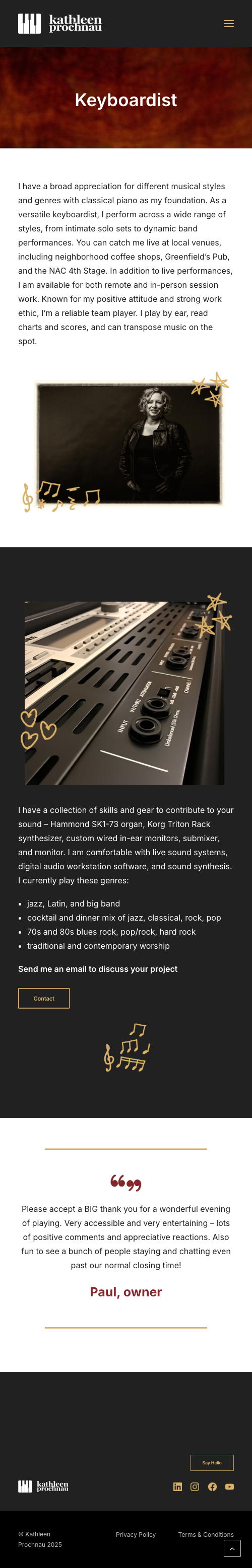
On the Piano page, it was decided the introductory part would look better if it was widened to keep the page margins consistent. I also decided to add a unique doodle here to add more visual interest and help widen the section while keeping the text line length down. We decided that the Genres and Levels section would look better stacked in rows, and with accompanying icons instead of images. I thought using one musical note, two notes, and three notes as the levels increased was clever and appropriate. I tried using four notes for the 4th level but it didnt look geat squeezed into the circle or made smaller to fit. Also since the Performance Opportunities category seemed unique from the rest, I decided a one-off treble clef icon would suffice.
As for the quote section, I thought using long lines would break up the space and frame the content, as well as stay consistent with the subheading underlines throughout the rest of the site. I decided to implement quotation mark icons to reinforce that this is a quote, and to add nice visual weight as well.
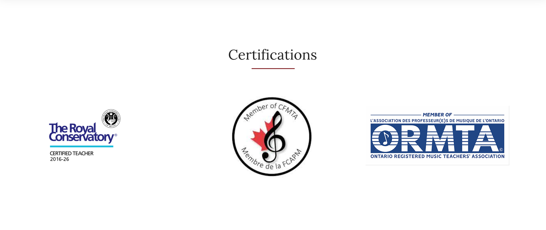
On the About page, originally I had the banner at a fairly large size, but Percolator and I agreed it looked better at a slightly narrower size. Another background was changed from red garnet colour to the black charcoal colour for reasons mentioned previously. The Certifications sections images were slightly reduced in size as the area looked a bit too bold before.
For the Piano page, the image of the texts with gold doodles shows how the first section looked before and after widening it to match the rest of the site, which was a nice improvement. The Genres and Levels section background was also changed to from garnet to charcoal for consistency and visual clarity as mentioned previously.

Once the client was happy with the high fidelity example pages and their changes were implemented, I began building the website. They wanted to use Wordpress to create the site as it was more accesible and they were familiar with it. Because of this however, I was a bit restricted as the Wordpess website builder didn't allow a huge amount of customization. Certain tools were also missing or limited, and as a web designer I was missing some more advanced options.
I had also never used Wordpress before so there were some initial difficulties with learning to use it. There were also some issues adding the brands fonts, as they wanted you use their built in fonts. The builder didn't use web design terminology I was used to as well, as it used more common words that were slightly confusing. The builder also had issues saving components and element styles to reuse across the site, which was a bit tricky at times. I quickly became proficient with it however, through some help from the internet, Percolator, and with my technical and problem solving skills.
Once I built version 1, Percolator had some changes to try before moving forward with the client. The first was to add the red call-to-action sections to the bottom of every Services page (Piano, Keyboard Harmony, Written Theory, Accompanist and Keyboardist). Next was to change all Book an Appointment buttons text to Say Hello! instead.
On the About page, the images on the Certifications section were made into links that would bring you to the relevent site when clicked on, which was a helpful touch that made the site even more informative.
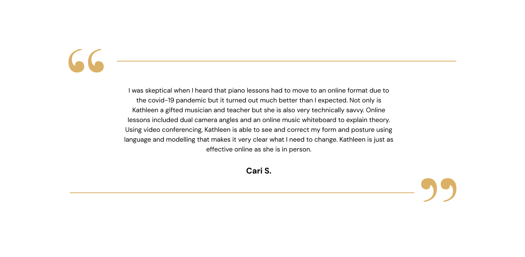
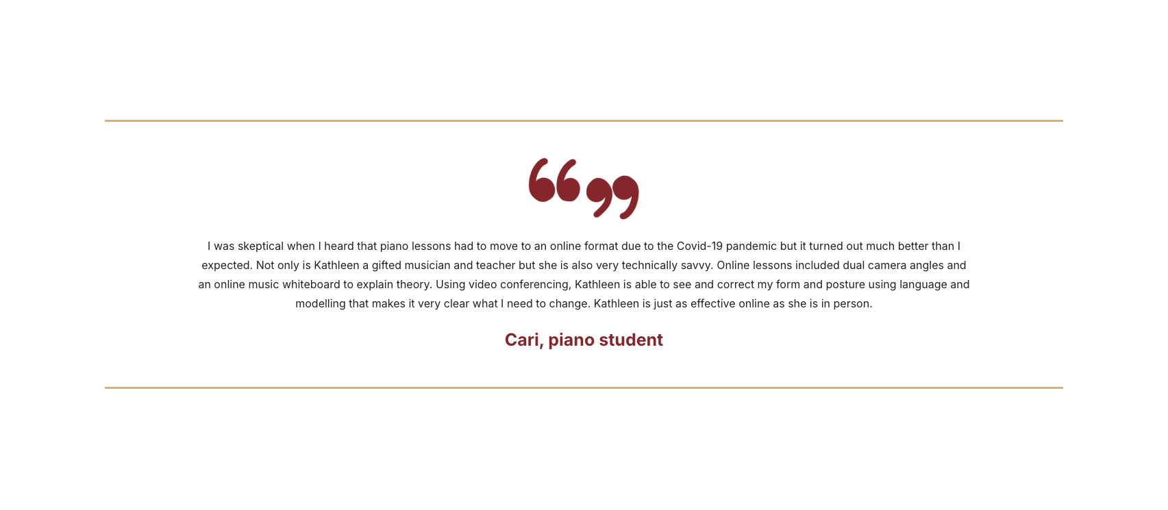
For the Services page, the client preffered using the doodles as decorations to images, and not stand alone illustrations, so they were removed in sections that had them. The quote section also had some alterations done to it. I drew quotation marks to replace the typed ones to match the rougher doodle illustration style. They were moved from the sides to the center, and were changed to red along with the persons name as well. Having the quotation illustrations and text in red also made these sections unique and more distinct.
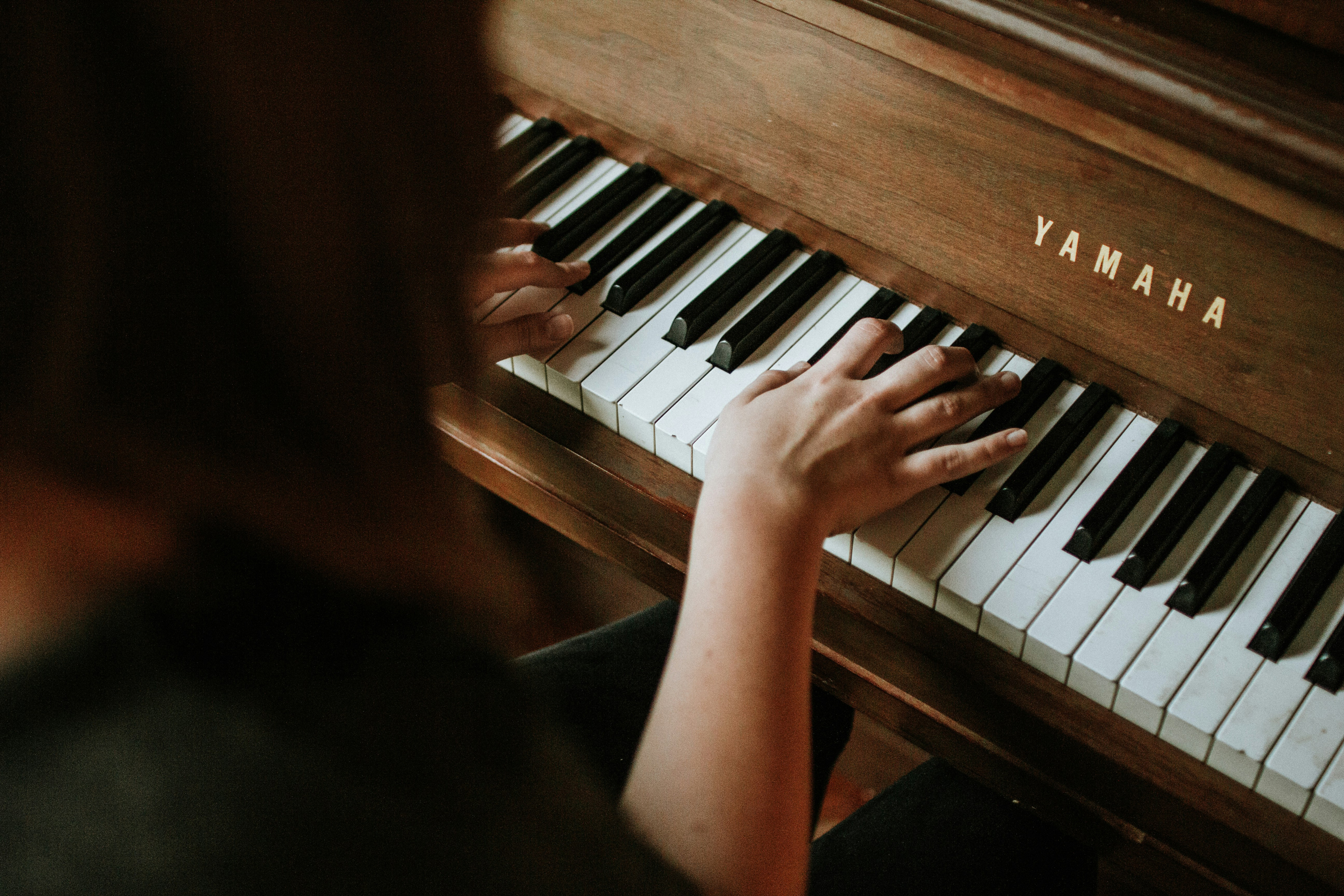
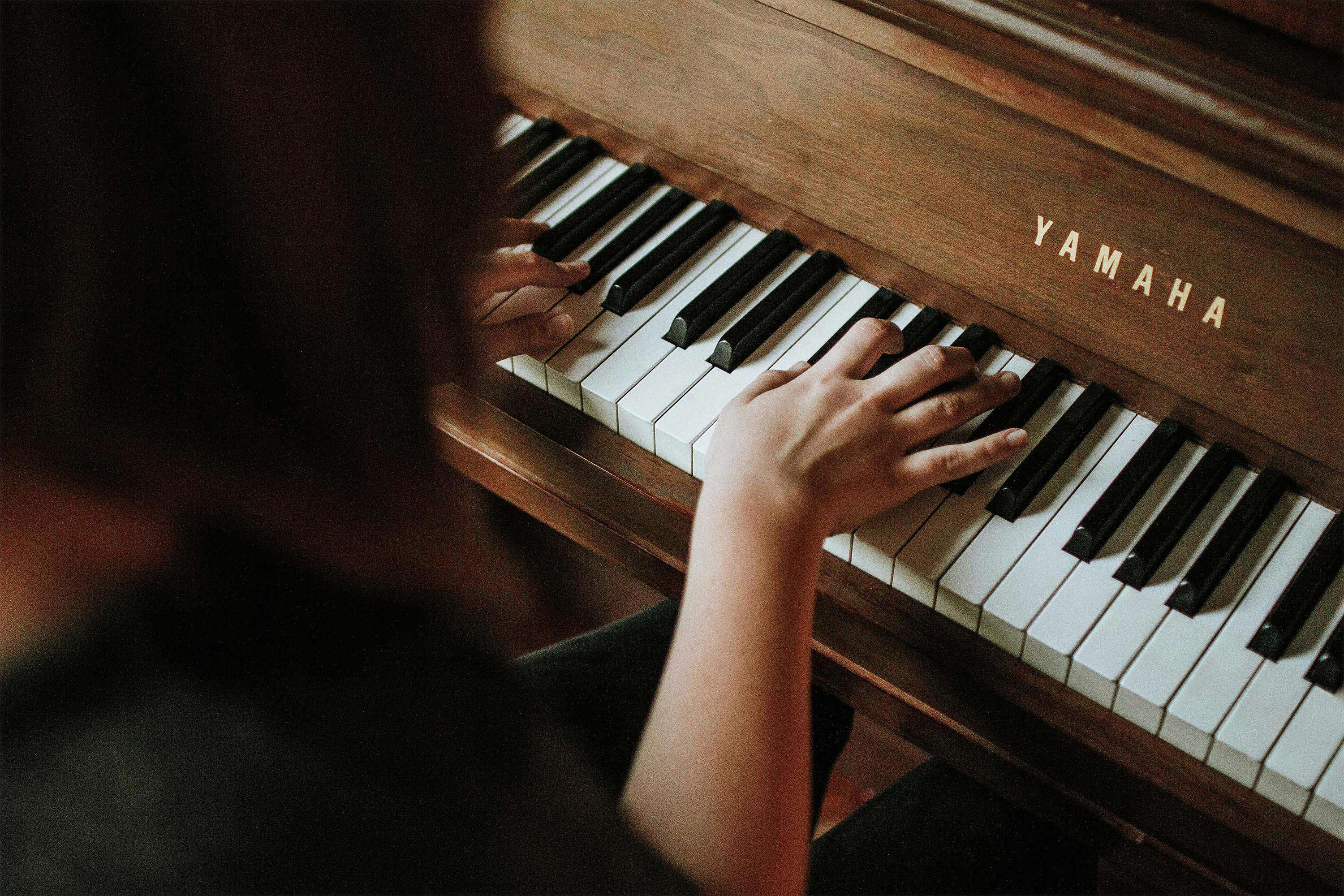
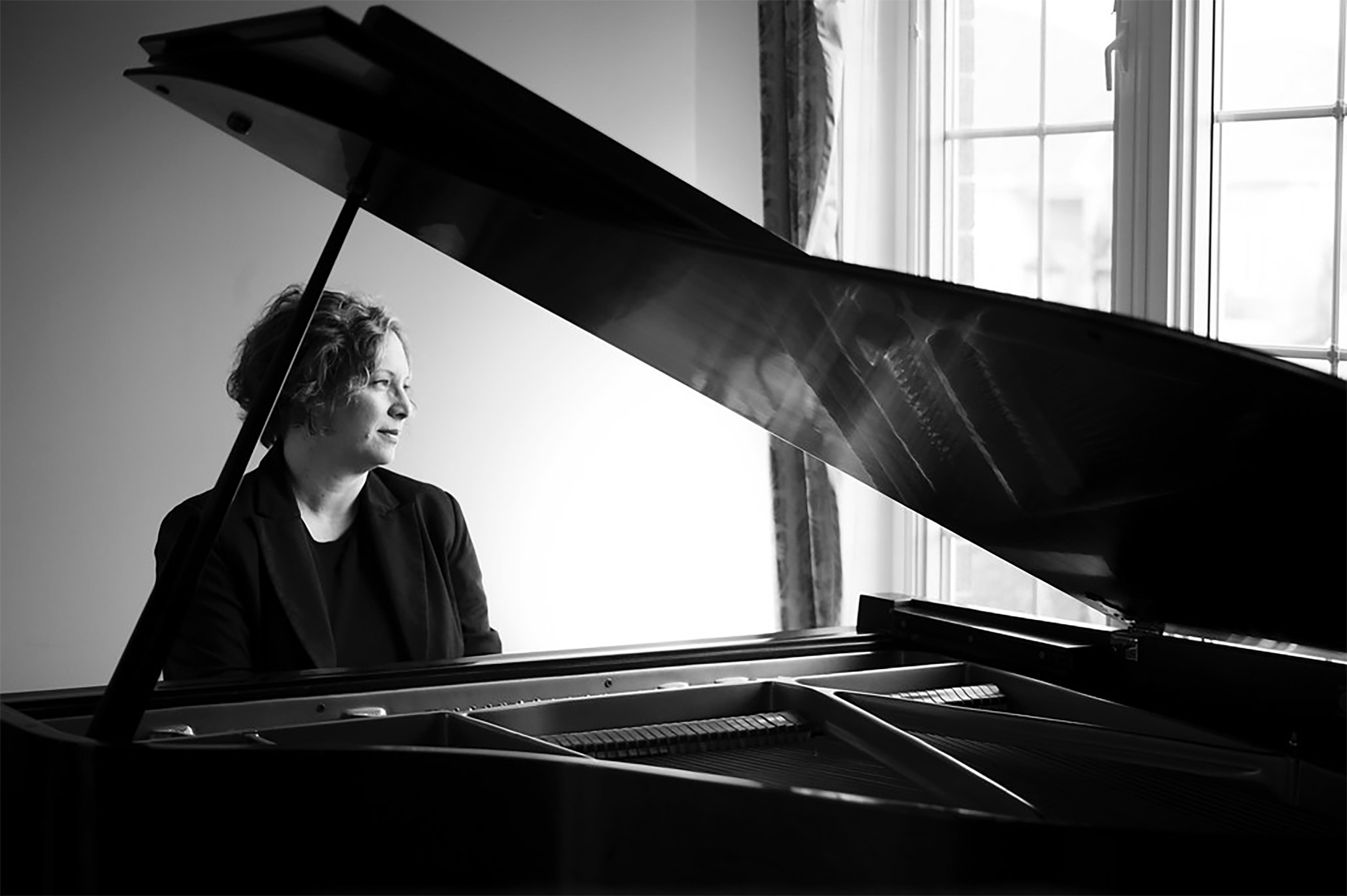
The client also really liked the image they provided for the home page banner, but felt they had to unfortunately use a different one as the piano keys were chipped and dirty. I offered to fix it in photoshop, and the client was happy with the result so we kept it as the banner image.
Next, the client provided personal photos as requested for certain areas. For photos they didn't have, I had to find stock images that met their criteria:
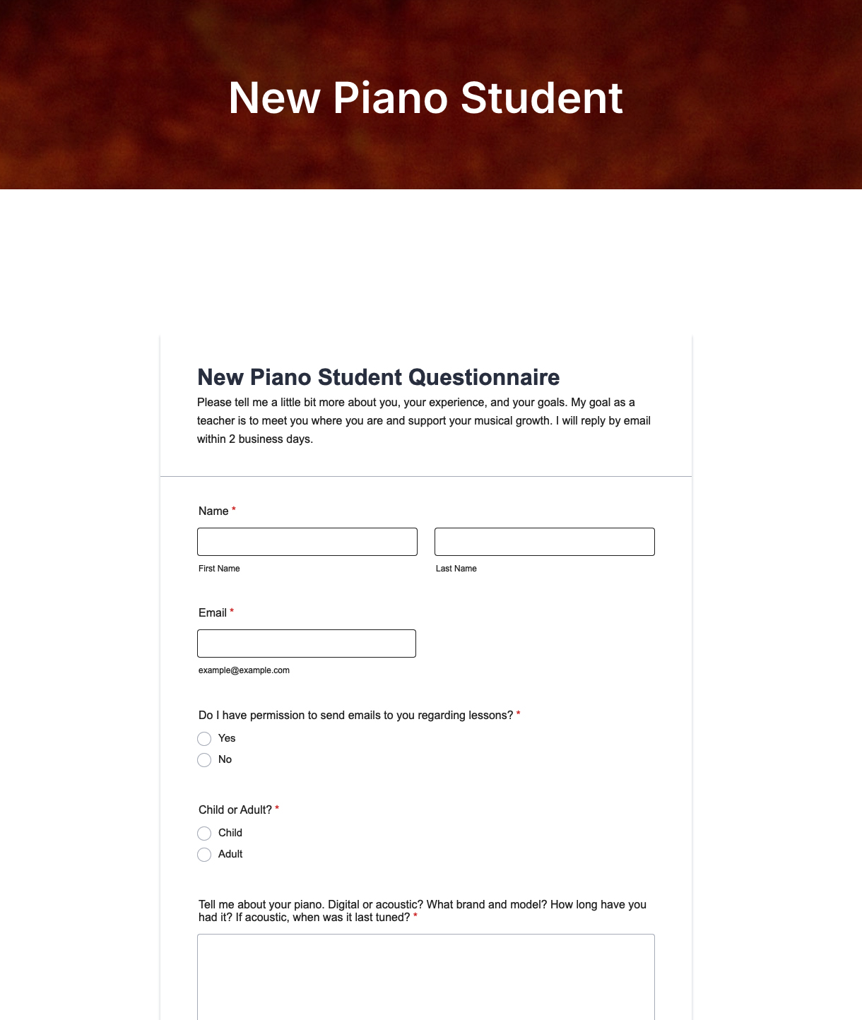
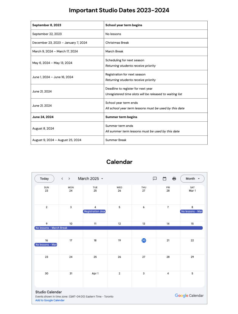
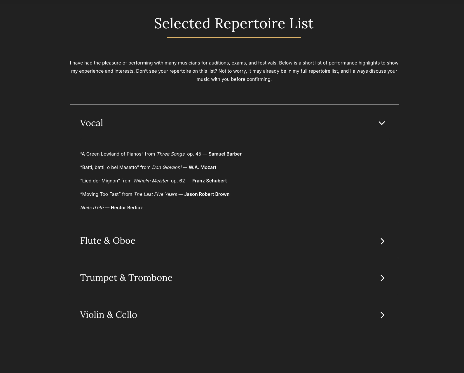
For the Selected Repetoire List section, I added a sleek drop down style menu, so the user could find what they were looking for without the rest of the list item information in the way. I also added forms, a table, and calendar to the student pages which was a bit tricky to get working right at first.
The client felt that some of the images were a bit too crowded with doodles, and only wanted to use certain ones in different arrangements. They also provided doodles they drew themselves to add a cool personal touch. They didn't draw or want me to redraw the circular doodles used as icons however, as they were happy with my original ones.
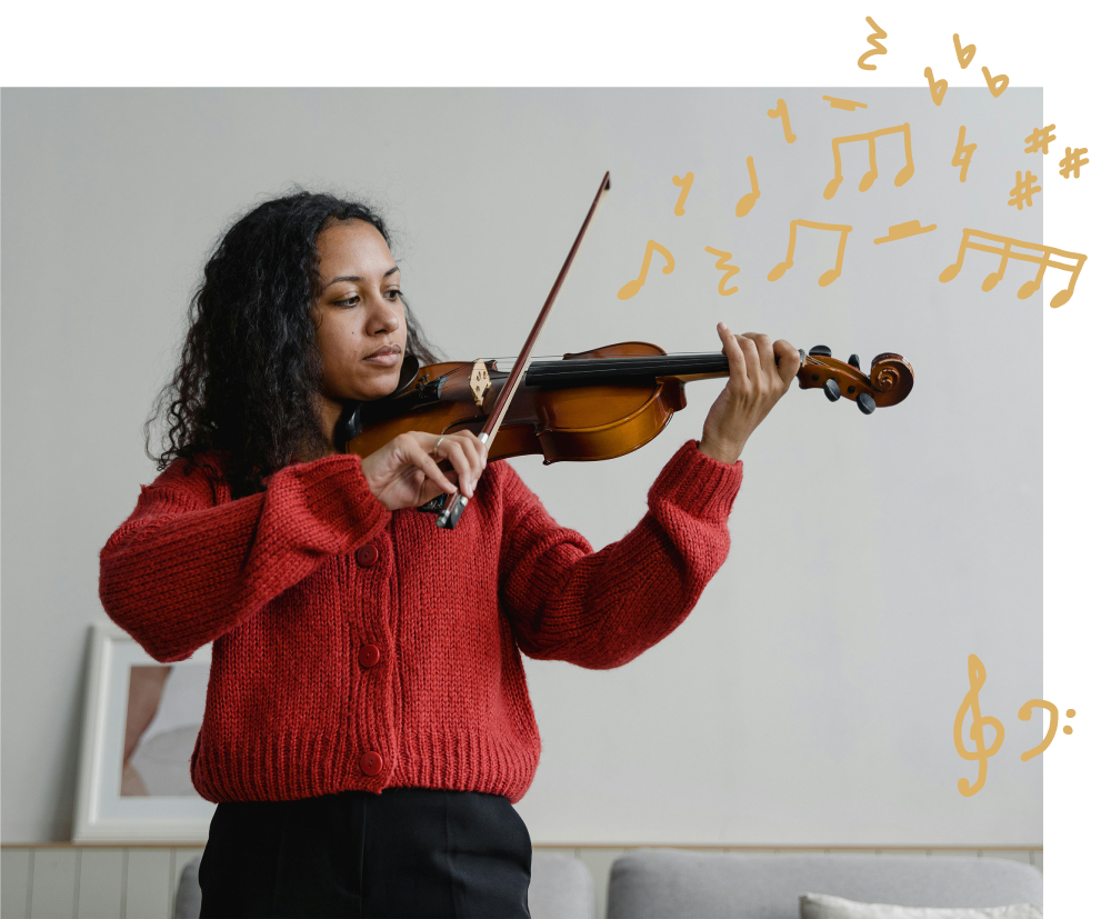
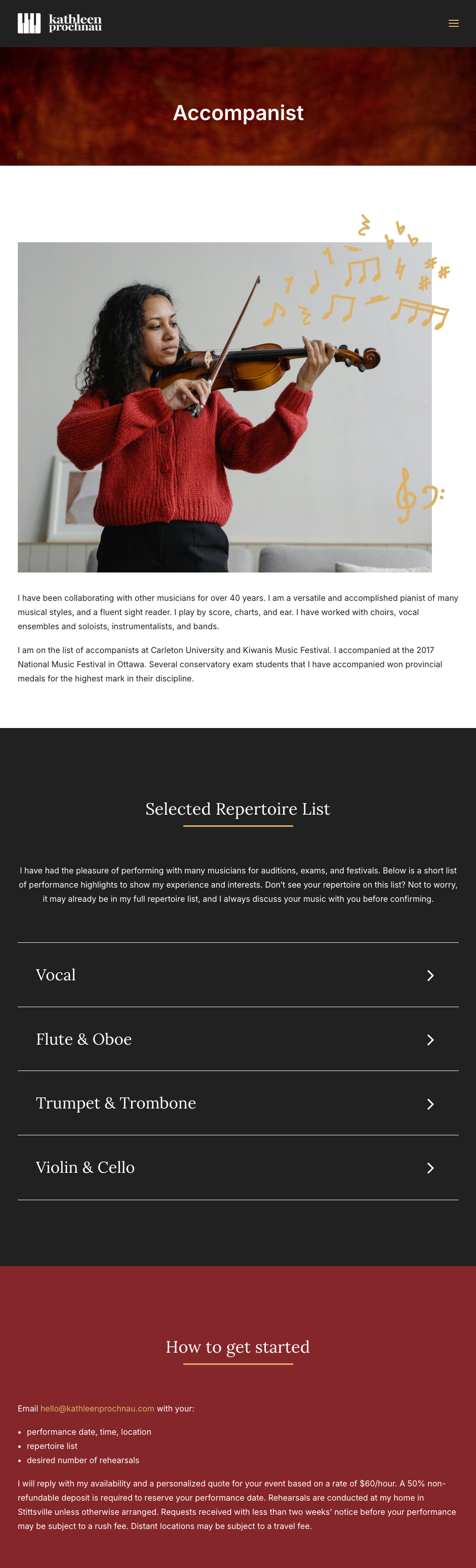
Some images were also changed at the clients request. For the image on the Written Theory page, the doodles were swapped and reduced. On the Accompanist page, the image was swapped out to one showing a violin player. The Keyboardist page image was also altered slightly. Lastly, the About page one was changed to a grayscale image with no doodles.
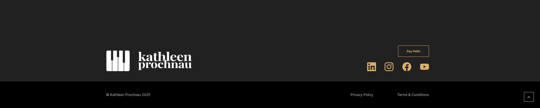
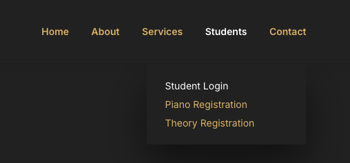
The header and footer went through a couple diiferent iterations since the wireframes. We ended up with this final version which removed the social icons, as they now had their own section on some pages, and were now in the footer as well. The call-to-action button was also removed as that was now present in many other areas throughout the site. The navigation text was changed to gold which would change to white when selected. the drop down items also followed this style.
For the footer, the informational text was removed as it was deemed unecessary, and the social icons were moved to the right for better balance with the logo on the left. This also helped the logo stand out more now that it's on its own.


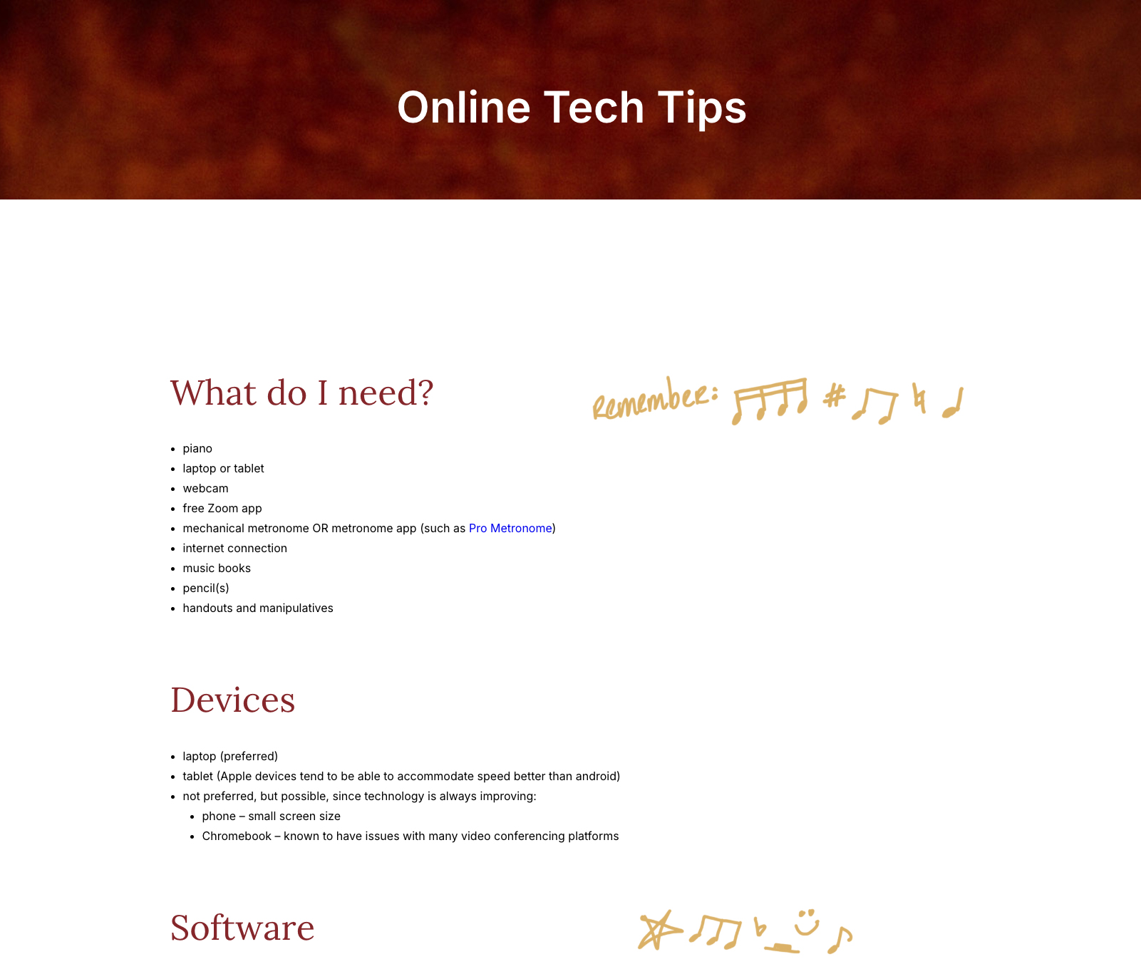
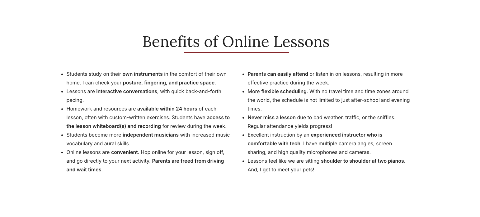
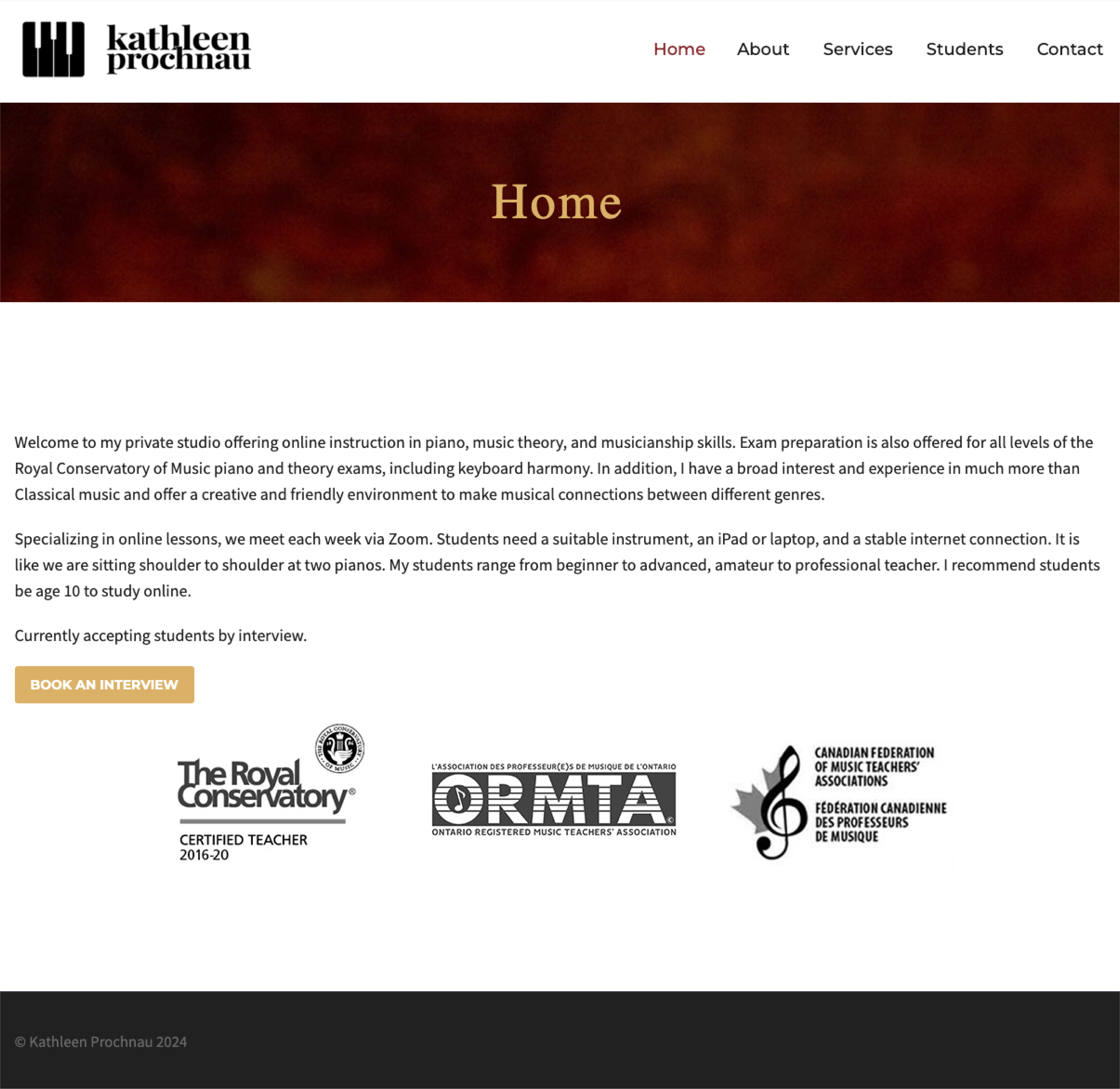
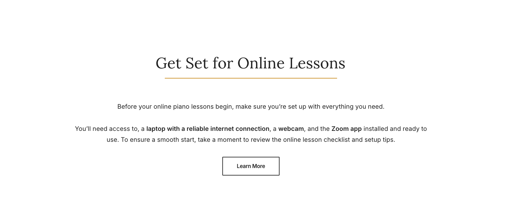
The client added online information content and wanted a seperate Online Tech Tips page to help students with remote piano lessons. I made a Get Set for Online Lessons section after the client provided the text to inform students about online learning. This new section was added to the Piano, Keyboard Hamony and Written Theory pages as these were the lesson offering pages. A Benefits of Online Lessons informational section was added to the homepage to further advertise and promote the online lessons. This new section replaced the Recent Posts blog section as the client wanted that removed because they felt it didn’t serve a function anymore.
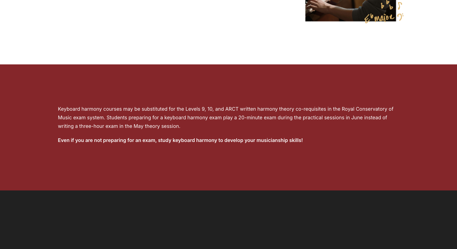
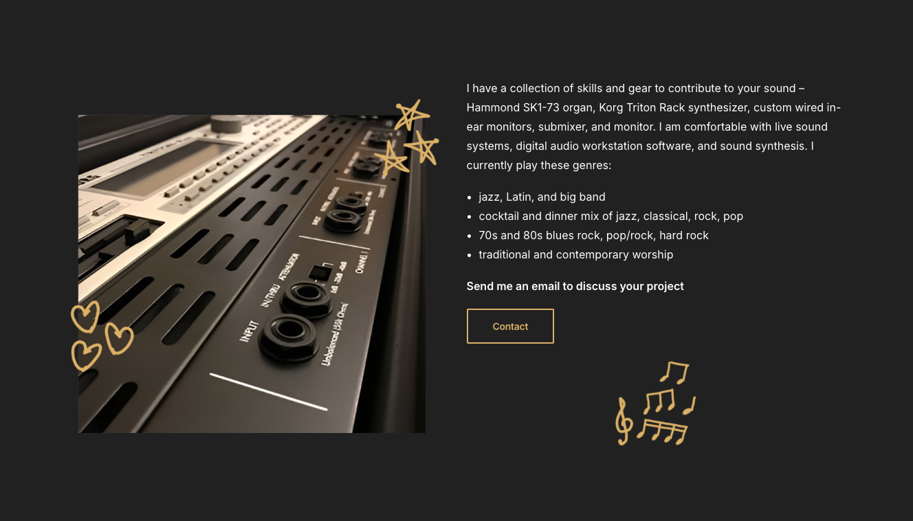
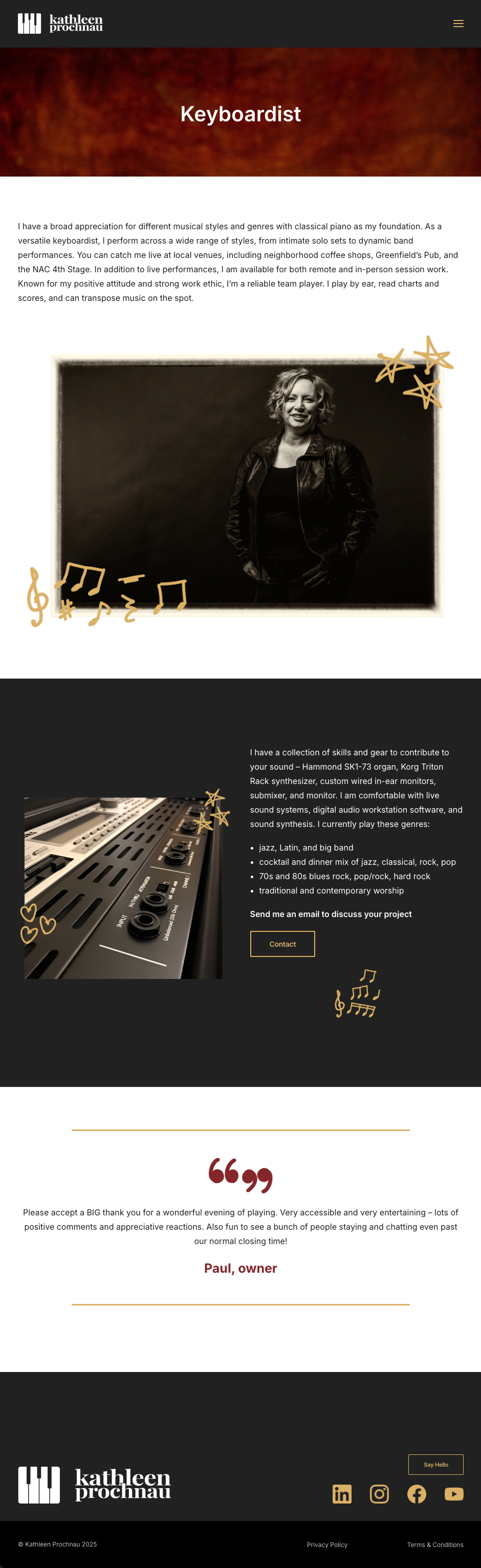
More information was added to the Accompanist page, Keyboard Harmony page, and Keyboardist page, as the client felt further clarity was needed here.
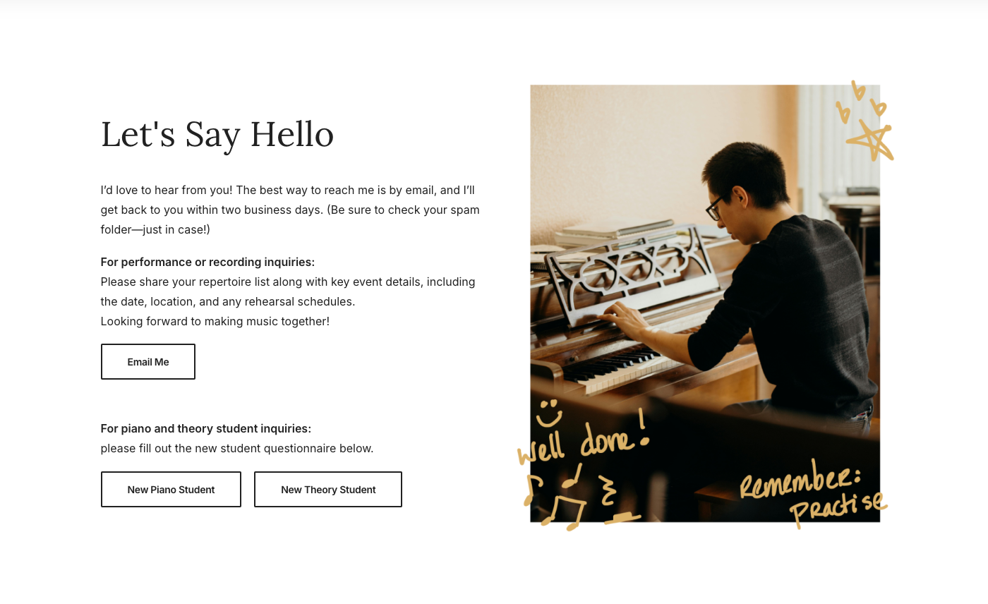
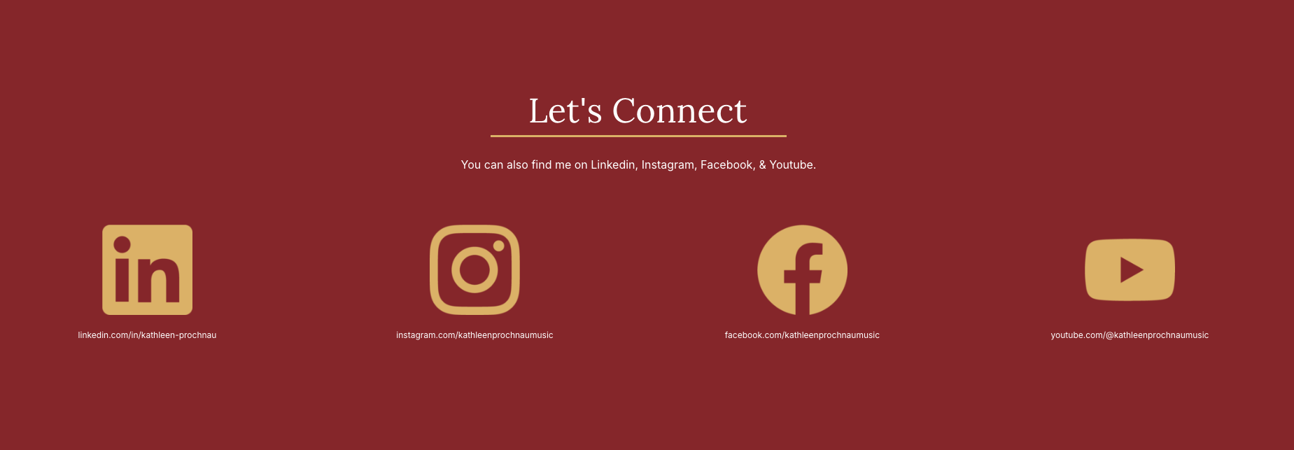
Password protection and application forms were finalized on the student and registration pages. On the Contact page, extra information and new buttons were added that linked to the registration pages. I made a new Let's Connect section with social media links on the About page and Contact page as the client wanted to promote their channels on these pages.
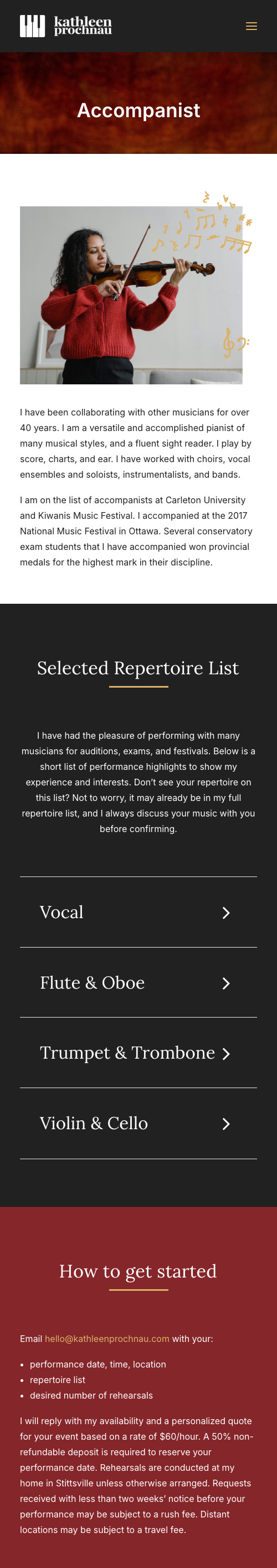
Here's what the wesbite looks like for tablet size screens and mobile screens. During the entire process I was sure to keep these smaller sizes in mind when designing, and would check and adjust the layout as needed so the site would remain working and looking professional throughout the build.
I animated certain elements across the site at the clients approval during the redesign as well. Some headings and cards would slide up during scroll, as seen on the homepage. Icons like the social media logos, circular doodles, and quotation marks would also slide into view while scrolling by. These animations worked to make the site seem livelier, more modern, and elegant. Sticking to only using slide-up or slide-in animations kept the pages looking consistent and not too busy looking, keeping the focus on the information.
The client was very happy with the final result, and overall the redesign was a success. The new website feels fresh, modern, informative, friendly, and persuasive to potential piano students. I'm happy with the how the site turned out, and the client especially liked the animations, as well as how the doodles made the site feel personal, inviting, and unique.